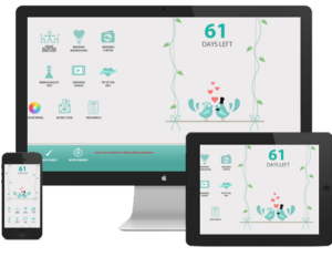
Web design is a very important aspect of website development. The visual appeal, functionality, and usability of a website will be a huge factor in how appealing it is to your target readers. Also, a great website design will not remain great if it is not updated or redesigned to keep up with design trends. No matter how your website has been, a great website design is one that keeps on changing and being updated according to current industry trends and practices.
If you are planning to update your website design this 2014, below are some of the design trends that would be good to know so you can be specific with your web design company with what you want on your website.
Web Design Trends
 Responsive web design.
 This is one trend that will hugely impact your current website. A responsive web design is one that adapts or adjusts according to the user’s screen size. With the growing number of Internet users who use a variety of devices for online browsing, having a website that will look good on any device is a must.
Parallax.
For those who want a 3D effect on their websites, putting a parallax effect is good. This kind of design is a “scrolling technique that helps in conjuring the illusion of the depth of field to the user”. This effect combines a great mix of effects on movement, depth, and 3D illusions.
Flat design.
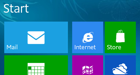
Think Windows 8 – this kind of flat user interface is enjoying renewed popularity. This can be attributed to the clean and minimalist look that a flat design can provide. Aside from this, a flat design is relatively easier and more straightforward to use.

Clean and minimalist.
With the fast-paced lives of most people these days, there is no room for browsing a website that looks cluttered and whose navigation takes a little figuring out. What users are after are websites that are clean and minimalist, and can be used instinctively. Simplicity is the key so make sure to maintain a simple feel around your website.
Interactive.
The use of infographics has increased in popularity tremendously the past few years. A great way to utilize your infographics and make them more functional is to make them interactive. With how common touch screens are, this should not be too difficult. Extend the use of interactive infographics by transforming your whole website into a huge interactive infographic.
One-page design.
A house with several different rooms is, of course, more complex and difficult to navigate than one with just a single room. In the same line of reasoning, more websites are choosing to limit the number of pages to just one. These websites make use of lightboxes, overlays, and tiles that can be easily repositioned and expanded for various content on their websites.
Mix and match typography.
There are thousands (or even millions!) of fonts that you can choose from nowadays; why limit your design to just one? Using even just two different fonts can drastically change the readability of a particular content, even more so if you use more than two in a reasonable manner. Put variety in your typography in terms of size and styling. You may also want to utilize responsive typography that will make your site more interactive as well. However, make sure not to overdo the mixing and matching of typography. You would not want your website to look like it uses every font there is for you to use.

Mobile-ready.
Having a responsive web design and one that is mobile-ready are two different things. You may have a website that looks good on any screen size but may not be well-optimized for mobile devices. A lot of web designers are designing websites in reverse nowadays. Instead of taking a desktop-friendly design and adjusting it to make it mobile-friendly, they are now designing a website first to be mobile-friendly and then adjusting it to be desktop-friendly as well. You can also make use of a minimalist navigation design such as a dropped sidebar.
Illustrations.
The Internet is undoubtedly a very visual medium. Hence, elements that appeal to the sense of sight are almost always welcome. Illustrations and images in a website are musts if you want it to be visually appealing. To make your images more interesting, add overlays and blurriness effects.
Video background.
A growing number of websites are now using videos in place of text to get a particular message across to its visitors. Why use static text when you can use exciting and dynamic videos? Many websites have even extended the use of videos in their websites by using the video as their website background.
Top 10 Web Design Trends for 2014 Infographic
Related Articles:
- Traffic Conversion: Five (5) Basic Features Of A Traffic-Converting Website
- 26 Digital Marketing Statistics you shouldn’t miss
- Why you should take advantage of mobile and social media


