Your website is one of your primary online marketing avenues so it should be able to represent your company the best way possible. Moreover, most of the details about your business or group are there. People would love to know more about you and find the ways to reach you. But how will your leads or potential customers be able to do that if upon entering your website, all they want to do is leave?
You might have done some unforgivable offenses that drive your visitors away from your site. Grab a pen and paper, and assess your page if you have one or a couple more of these reasons:
It seems to load eternally
 The loading time of your website is heavily impacted by the media files uploaded, and codes used. Though there are instances where it is the user’s Internet service provider’s wrongdoing, they would still probably blame your page especially if they tried to close and reopen your page and nothing happened. Based on studies, 47% of your web visitors expect it to load in two (2) seconds or less. Thus 40% leave your website if it takes more than three (3) seconds. You should always note how short the attention span of people is and how busy the lifestyle most of us have. No wasting of time needed.
Not optimized for mobile phones and tablets
Don’t you know that Google updated a major mobile algorithm last summer 2015, which penalizes websites that aren’t mobile-friendly? It was also said that they would be ranking mobile-friendly websites better on May 1, 2016. Good thing Google understands providing the quality user experience. It is annoying when you need to zoom or scroll from side-to-side just to see all the contents and worse, the letters will be too small for you to read. Other visitors would rather look for other websites.
 The design is just discouraging
Media that plays automatically (worse if it’s from ads) which has nothing to do with your business or irritating graphics and formatting of contents. Don’t make your visitors think your website is a joke! Or don’t bore them with draggy texts and massive irrelevant information. Balance professionalism and creativity of your web design.
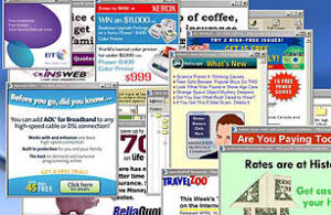
Tons of unnecessary pop-ups and walking ads

It sends a negative image to your visitors that either your website is not that legit (because why would you flood your page with a lot of ads and pop-ups) or you don’t give a thing about user experience, and you just want to sell and promote endlessly. There’s nothing wrong with pop-ups and ads but please, give your visitors a peace of mind, and use them in moderation. Moreover, pop-ups and ads make your website load slower.
Visitors are looking for “Search”
Your users are in a hurry or desperately need something o your page. Of course, the easiest thing to find out is to go to “Search” and type whatever they need or want to get. But what if that button is nowhere to be found? Or maybe there but not working and doesn’t really perform its task of filtering results? You are in a great trouble as most of the customers opt to leave if they can’t quickly get what they are looking for. Your visitors do not have the luxury of time to browse all of your page’s contents.
Tricky and annoying “Contact Us” requirements
Some are aware of the bots harvesting email addresses online, so visitors type their details in ways their contact information will be safe. You should note that and consider removing “your email is invalid” unless you can assure your visitors that your website is secured and their emails will not receive ads or promotions from other companies or even from you unless they click “Subscribe.”
There are also some instances where your page caters to different countries, but your contact form doesn’t accept other phone number formats. Seriously, why do you even tell us to communicate with you if you will make it hard for us? Bye.
And there’s no “About Us”
Personally, when I am interested in a company or to the products and services they offer, I head out to their “About Us.” It’s sort of a background check that I do. So I understand the frustration of other Internet users whenever there’s no “About Us” when they want to know more about the company or group. On the other hand, it might be on your page, but it is poorly written – still an issue.
The links or other landing pages are not working
You should update the details particularly the links and make sure they are functional. Another thing is to use less external links as it also annoys your visitors the same way links are not working. So general rule, use everything in moderation.
 The contents of your page has little do with your business
Similar to the problem of your “About Us,” some of the contents present in your website are not related to your offers or even about your company. Your user’s visit in your page should just be a walk in the park, and they should be able to spot what is unique or outstanding with your company immediately. You don’t want your visitors to be bored and tired of analyzing and figuring out what your business is all about.
On the other hand, keyword-stuffed copy contents are also a disaster for your page. If you have blogs section on your page, do write for your customers and not just for the bots. Remember that Google’s algorithm has changed.
You have click-bait headlines
 Be it the title of your blogs or headlines on your web page; they should not be sketchy and click-bait. They may have thought that it’s what they are looking for and just be disappointed upon checking. Don’t fool your users! They will not trust you with your words and worse with what you are offering to them.
Do not forget that you should be able to give a great user experience to your page’s visitors. It should be able to welcome your visitors to your company similar to how you would like to welcome people in your office. If you have any issues with your page, it’s time to do the changes by your team to redesign now.


