People have this mindset that effective web design is all about the visual when it should also be about the site’s usability and function. Although visual appeal is equally important, web design should also factor in a good user experience (UX). Both factors – form and function – composed a persuasive web design.
Integrating the concept of persuasiveness in design is crucial in increasing conversion rates. This will entice the user to act on what they see. Of course, the most important conversion is a purchase wherein the persuasive web design converts casual visitors into paying visitors.
How a person comes up with a purchasing decision
Convenience, familiarity, trust, and more
Humans are wired to look for the best in everything, including a website. This is the same reason why a user would hit the close button within just 5 seconds or less. In fact, experts say that it takes 50 milliseconds to form an opinion about the website’s design.
Convenience matters, and so are instant gratification and the path of least resistance, among important things. A great experience thereby starts with a relatable and comprehensible design that requires minimal effort.
As users, we look for certain things before we even contemplate the idea of purchasing from a website. Familiarity must be established first. People look for patterns and elements that are familiar to them.
If these are nonexistent, trust will not be built and would only lead to confusion. Prioritize reassuring experiences instead. A user who feels safe while on your website is more likely to transact with the business.
Visual stimuli and the possibility of loss
Individuals may feel more secure when there are visual stimuli. This is particularly true when there’s neat and clear navigation that guides the user in finding what made him land on the website initially. This contributes to making the design less complex and thus, compels the visitor to buy.
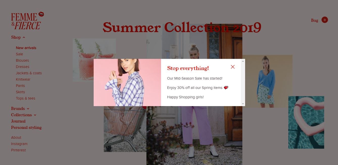
A person also buys when there is a possibility of loss. In other words, the sense of urgency is another reason why a user may be persuaded to complete a sale. Fears, uncertainties, and doubts (FUDs) are utilizable elements in creating a sense of urgency.
Repeat purchases, furthermore, can be explained by the sense of delight. It is not enough that the individual is satisfied with his purchase. There should be an emotional appeal to the entire experience. For example, things that delight customers are a well-packaged parcel or advanced delivery with freebies.
In terms of web design, a delightful visual experience forms part of the persuasion process. If the web design is familiar, safe, clean, appealing, and has a sense of urgency and a sense of delight, it can be easier to persuade visitors to become buyers.
Understanding design to convert
Before you hire a web design Philippines service provider, you should first identify why you need a website and what will it do exactly. Some businesses build a site to grow their email list. Others want people to check out their goods and make a purchase. When a user completes these things, then a website successfully makes a conversion.
Each website has a unique conversion because companies have different goals. If you wish to define your conversion, you must first identify your targets for your website. When people come to your site, what’s the first thing you want them to do? What do you want to offer to the audience? These are a few of the questions you must answer before working with a web design agency. Answering these questions leads you to the desired actions you want for your website.
Once you determine your goals, you can measure their effectiveness through conversion rate. According to Wordstream, the conversion rate is the percentage of your site visitors that completed the desired action – in this case, your goal (conversion) – out of the total number of visitors. Knowing your conversion rate is essential in business and marketing planning. Thus, you must be aware of which factors affect your conversion rate to get more people to do what you want them to do.
How does web design affect your conversion?
Web design is one of the factors that affect your conversion rate. OptinMonster, on their “11 Web Design Principles that Will Boost Your Conversion Rate,” stated that almost half of users base a website’s credibility on on-site design. The information came from a study by Stanford University. With that in mind, Adobe did a survey that showed 38% of people leave the site if it’s unattractive. Thus, you won’t get the traffic or revenue you are aiming for if your site design sucks.
Importance of designing for conversion
Design to convert is the mantra. If you won’t do this in the first place, there is no point in web design. The attractiveness of the website will be useless if it is not good enough to affect conversion. It also means that the website fails to provide solutions to the problems of its target users.
Consider the numbers below in addition to these digital marketing statistics.
- About 94% of a website’s negative feedback is design-related
- About 38% of the users stop engaging with a site with an unattractive layout
- Approximately 88% of the buyers will not return to the site after a bad experience
- About 77% of agencies mention that a poorly designed website is one of the client weaknesses
With this said, designing for conversion also helps in building trust and confidence among the users. These must be established first for the users to respond positively to the calls to action present.
While there is no perfect website, it would help develop an optimized site as possible design-wise. Toward this end, it would help to understand the principles behind designing for conversion.
Deciding on the conversion rates
Digital marketing efforts are typically designed for conversion. Thus, it is a goal that is founded on transforming passive observers, sometimes referred to as digital lurkers, into active participants.
What conversion rate is the most applicable and realistic depends on your current goals. The industry average is 2.35%, so targeting between 2 and 3% is feasible. Then again, look into your present conversion rates. If you already hit the 3% rate, by all means, amp it up to 4%.
Bottom line, do not proceed with your online marketing efforts without deciding on the appropriate conversion rate.
Principles of persuasion
These principles are the motivation behind persuasion.
Reciprocity
Users engage with websites that blatantly offer something valuable to them. Even before they take action, it is clear to the visitors what’s in it for them – a small freebie, personalized content, or exclusive offer.
Commitment/consistency
Visitors make a decision and commit to that decision moving forward. Reinforcements are necessary to push the users down the sales funnel, for instance, so they act on their initial commitment.
Social proofing
The trustworthiness of a website is important. One way to do this is by displaying social proof. Users can easily detect if the social proofs are fake or not, so don’t dare try to bloat the numbers. Aside, social proofs can be easily verified.
Trust seals such as these proofs and reviews and testimonials influence the human brain to believe that the website is safe. This sense of security is, at times, all the assurance that the users need to complete the buyer’s journey.
Authority
People follow their heroes, their leaders, or the authoritative figures in their lives. There is inherent trust among these people in our lives. And leveraging trust can be achieved as simple as putting an image of the site’s owner or celebrity endorser.
When it comes to persuasion, authority influences credibility.
Likeability
Consumers can get easily influenced by recommendations. Target users have the propensity to listen to the people they like and act on this. This likeability makes the process more humane.
Scarcity
In persuasion, more is not always good. Limited choices are more appropriate. People are averse to confusion. Thus, the preference is a direct path to decide to make a purchase.
Scarcity may also mean clutter-free that drives the individuals to act more quickly.
Benefits of persuasive web design
Thousands of websites are launched daily. Virtually all these sites want to attract, engage, convert, and finally, retain visitors. Unfortunately, not all websites can do all these because they do not take design and functionality seriously.
These websites fail to recognize the fact that the first impression is critical even in the digital world. This is especially applicable in having a website that is the face of the brand digitally.
With this in mind, the power of persuasion lies in understanding and analyzing the intentions, motivations, needs, and preferences of the target audience and integrating these factors into the design. Only those websites that understand the how and the why of the users are the ones who can successfully persuade them.
Therefore, a well-designed website will receive 1) convert-ready users, 2) users who enjoy the experiences presented, and 3) users who become repeat visitors and, thus, loyal customers.
READ MORE: How To Keep Visitors in Your Website
Persuasive web design tips to increase conversion rates
Often, your website design is overlooked. You are focused on giving the best experience and the fastest service to your clients that you miss out on getting help from a web design company. A web design Philippines company would know the rules that can help you increase your conversion rate by creating a seamless design.
Still, your website design can be a personal project. If you wish to revamp your site and give it a new look to raise your conversion rate, then here are the web design tips you can try and follow. These tips also apply to UX designers and website designers who want to come up with efficient designs.
There are specific ways to optimize the design to minimize the flaws that drive the visitors away and your competitors.
Improve the visual appeal
Before the site may capture the heart of the users, it must catch their eyes first. Such a stance is the very reason why the site’s visual appeal must be emphasized. A person processes visuals 50x faster than text, which also means a user only needs at least 5 seconds to judge the site. Thus, putting more visual elements – the hook – would do the trick.
While at it also, do not forget that first impressions matter. If the site has an overall look and feel that is relatable enough for them, they will instantly like the website. Hence, striking a balance between visual appeal and quality content is important. The visual appeal shall support the site’s usability.
Get inspired with minimalist design
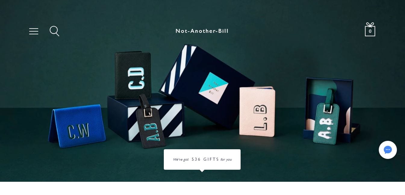
Minimalism is not only for home decor and lifestyle changes. It also applies to the concept of web design. To achieve a minimal look, you must only use elements with simple features. These are less distracting and blend seamlessly into the background. It also works perfectly with bright colors.
At the same time, minimalism thrives in white space. You must give your elements space to breathe and flourish. You must also embrace the flat design concept. Though they are less fancy, they are still functional and provide the best user experience to those who don’t want fonts and big design schemes.
Use the white space
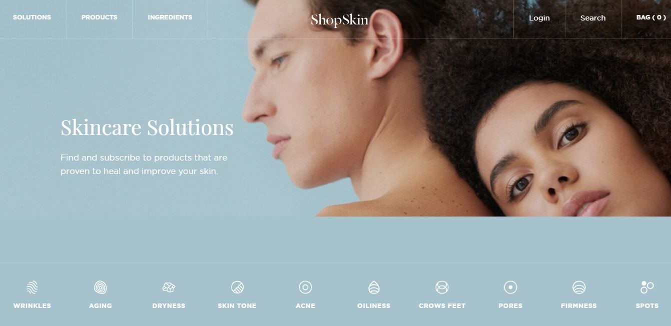
The white space of a page is also a negative space. It is the are between the sidebars, content, header, text, and paragraphs. Usually, these places are vacant. Keeping them free makes the website appear neat, organized, and easy to read.
But, you should take the rules of maintaining white space to heart. To boost your website’s impact on the user, you must combine the positive and negative areas. It positively affects user experience and presents ideas more effectively than placing everything on one side.
Here are other things you can do to maximize white space:
- Increase the space between letters when using a small font.
- The line-height must be 150% of the font size for the body copy. If you are working with a small font, you must use a larger than usual line-height.
- Add white space between large elements of the site using margins and padding.
- Break up your long text into small paragraphs to make them readable.
Prioritize clarity
Speaking of usability, the design must be simple and clear for it to convert. If it is not clear enough, it won’t be as functional as you want it to be. The layout and design must not only be attractive but convey the right message.
The persuasiveness of design is also based on the clarity of the message. It must be stated directly and succinctly. The thing is, the visual should direct the users to the textual message. In this way, they would find the information they need as quickly as possible.
Put simply, a clear web design helps the users ascertain what the brand and business are all about, the product and service offerings, and how these can be useful to them as consumers.
CHECK IT OUT: Web Design Checklist to Help You Stay on Track
Practice the Rule of Thirds
The Rule of Thirds is a principle of photography, but you can use it to generate a great web design. The principle shows a division of the image, both horizontal and vertical, into thirds. The result gives you nine equal squares and four intersections.
These intersections are also places of interest. When you place elements in these points, you can have the most impactful designs or images. You should place important messages, buttons, and compelling messages on these points if you want a high conversion rate. If you do put your design conversion factors on these points, you must keep other items off the intersection to keep the user focused on one thing only.
Work with an F-Layout
Researchers found that people look from left to right when looking at the beginning of a page. Their eyes move downwards with a few glimpses to the right. The bottom right of the page gets the least visibility of all areas of the page. The movement of the eye results in an F-pattern.
The behavior helps encourage conversions. Similar to the Rule of Thirds, you can place the most important elements along the F-pattern. Those that aren’t as important as other stuff can occupy the areas with low visibility.
Emphasize user-friendliness
The user-friendliness of the design is textbook. Again, visual and usability should exist side by side. A stunning website is a crowd drawer, but its unusability can easily turn them off and away too.
Therefore, to be persuasive, the design must allow the users to find the information they are looking for in a few steps or clicks. Guide them throughout their journey until they can complete it.
A user-friendly website also minimizes abandonment, which is typical on websites with complicated processes. When a user abandons the website, it means the design only frustrates them, not convincing them enough to complete the purchase.
With that said, the overall friendliness of the site carries on to the checkout page. Don’t expect to see them check out if the product pages are initially confusing them due to their lack of information, untappable buttons, unreadable texts, and so on.
Use trust signals
Only those authoritative websites can command users to do this and that. If you are not one of these sites, at least not yet, you may integrate features that build trust among the audience.
For instance, you may use the languages that your target users understand. Another trust signal is giving price options and in the currency that users are familiar with. Celebrity endorsements may also do the trick. Just make sure that your choice of celebrity will provide additional value to the brand.
Include faces to build a connection
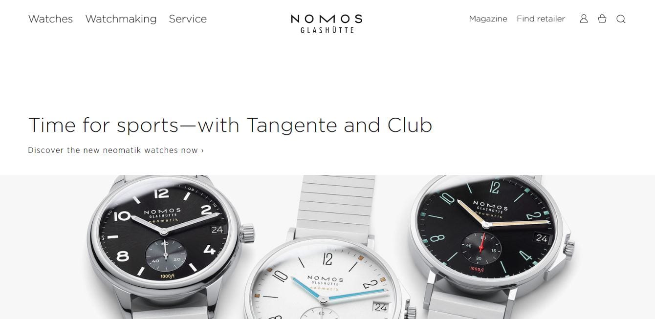
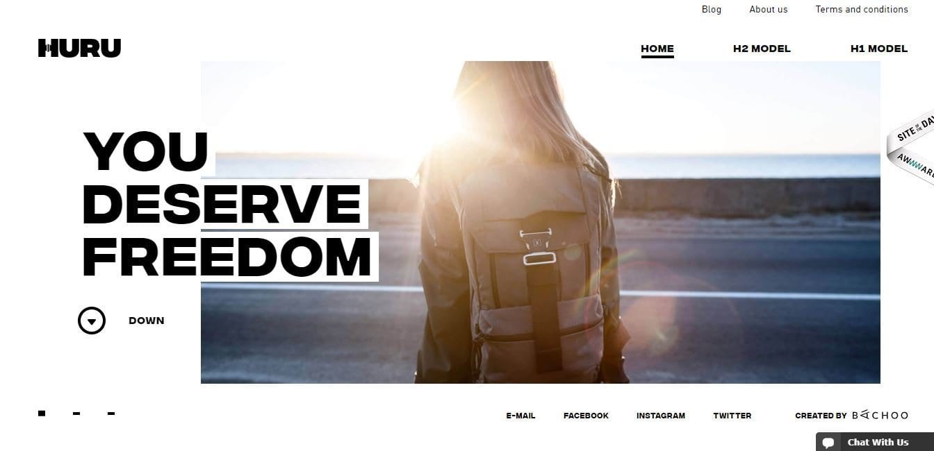
Faces show human emotions. Including on your webpage makes people empathize and connect with it. Thus, people can easily resonate with your messages, product, or services when a model is on the screen. Be sure to add faces on your articles, case studies, testimonials, opt-in pages, and landing pages to double its impact.
To have photos of people, you can use stock photos if you don’t have a model. If it’s a personal brand, you can hire a photographer to take shots of you with negative space on one side.
Avoid choice abundance
The principle behind it is simple: present the users with plenty of choices, and the decision-making process will be longer. Simply put, it is paralyzing while also deviating from your desire for the visitor to complete a sale quickly.
Too many choices are a noise that may cloud the person’s judgment. This is the paradox of choice that you must minimize in the design to make it more persuasive.
Create an urgency
Mentioning scarcity as a principle of persuasion, modern online marketing may rely on the fear of missing out (FOMO) phenomenon. Users are convinced to buy quickly due to loss aversion.
FOMO tactics are common among e-commerce websites, imbibing urgency by exclusive offers or flash sales. Another tactic is the on-site push notification.
Utilize the decoy principle
Consumers have their preferences, and this will reflect on their choice. The decoy principle refers to deploying a third comparable option with the first two options. The user will definitely choose the superior product and not the inferior ones.
This is mostly applicable for upselling such as pop-up advertisements that present the third option. Nevertheless, designs with pop-ups must be used sparingly because they basically annoy the users.
Use positive reinforcement
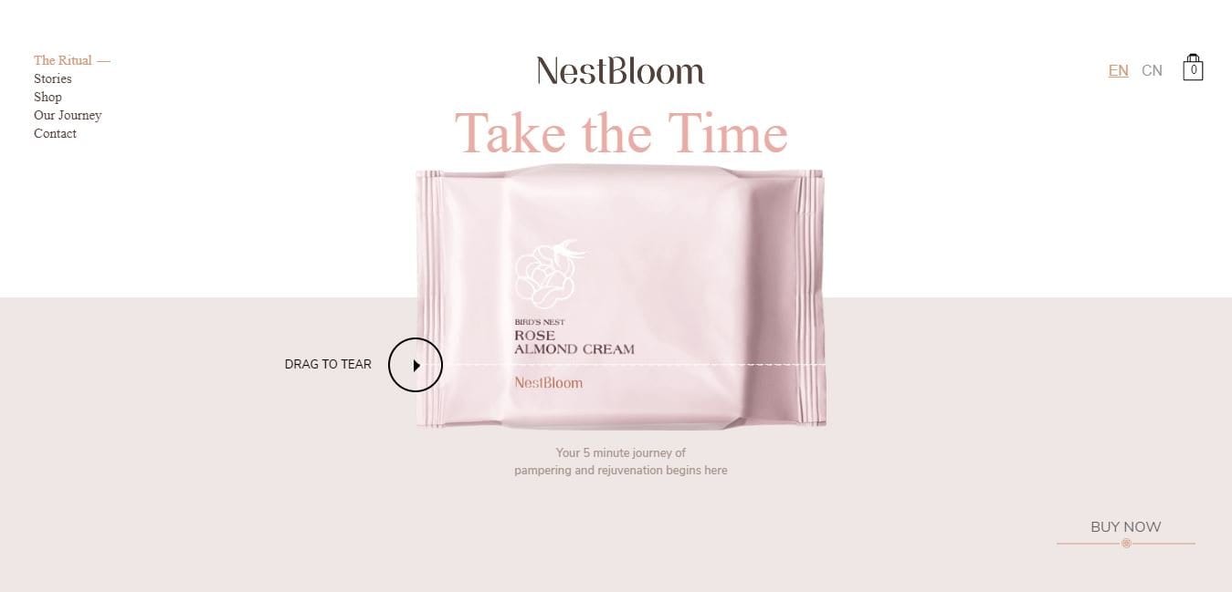
Humans, as consumers, are naturally inclined to reinforcements, especially those that enhance the overall experience. Although this is most apparent on thank you pages, there are many other ways to integrate positive reinforcement.
Examples of positive reinforcements are free recipes, consultant referrals, etc. Anything that can make the buyer happy can be considered as positive reinforcement.
Appeal to emotion
Consumers are emotional buyers. Well, the majority of us. Affecting people’s emotions can be done by highlighting happy customers on your design. It would be best if you made the buyer feel proud of his purchase.
Community bias applies here wherein community norms are central to making all the members feel safe and comfortable. The shared agenda makes people feel that they belong, they are important, thus enhancing confidence.
Publish clear information
Users visit your website for a reason – learn about your product offerings, buy something, obtain more information, etc. Whatever their reason may be, the information presented on your website must be clear enough.
If the users cannot figure out where the information is, they will leave your website and look elsewhere. There are many other websites out there, so they have no reason for putting up with your navigation complexities.
Understand behaviors
The buyer’s remorse is real. People struggle to buy more so when we are talking about big purchases and luxury items. It is even more difficult to persuade people to complete the sale.
The design should respect the buyer’s intelligence. Careful wording is important here. For instance, in selling luxury items, the justification is crucial, and so is the use of words such as “investment,” “state-of-the-art,” and “exclusively yours.”
Target expectations
Consistency is key. People do not go to your website to convert in one to two clicks. They will explore the website first. Consistency in design and message is essential to build confidence.
Guiding their expectations is as easy as using the same pattern on all pages for all products, for example. A sense of familiarity will reinforce actions.
Aim for the least amount of clicks, though
Make life simple. It should be easy for your users to get the information or complete the action they wish to accomplish with only a few clicks. It shouldn’t be a challenge for your visitors to understand your web design.
Simple navigation should be part of your web design. When things aren’t readily available, people might abandon your website for those that can provide what they need in a matter of seconds. It can increase your bounce rate and convince users to visit other sites instead. You should always test your site before anything else. Think of how it would be if you were the visitor. Stepping into a different perspective helps you find which parts of your design work and which don’t contribute at all.
Use clear calls to action
Do not bury the CTA buttons. Make them as big and bold as possible to make them stand out and for the visitors to notice them easily.
Make sure that the user will find the button within 3 seconds. The longer it takes for the user to find the right button, the longer the delay towards conversion.
As such, it would be impossible for your website to drive conversions if there are no effective CTA buttons.
Be consistent in using elements
Inconsistency can destroy your web design. It also contributes to poor design and branding. Using different font styles, sizes and incorporating various types of images on your site shows you are unprofessional. Consistency is not limited to these items. It must also cover the colors your use as well as the logos you place on your site.
You should have a set of fonts, color palettes, and types of images to use. You should set specific fonts for titles and headings. Meanwhile, you should assign a color based on the background. Doing these ensures you have a uniform design that matches your branding.
Pick the right colors
Colors are powerful. They capture the user’s attention and influence their behavior. Each color elicits a specific reaction from those who see it. Thus, having the right colors can represent your brand and dictate the mood of your website.
You should use contrasting colors to show off the essential elements of your site. These are banner headlines, a call-to-action button, or other messages. As much as possible, these elements must stand out from the rest of the site. They must be attractive and easy to remember. Using high contrasting colors helps you do that. Meanwhile, highlighting colors are best for the things you want users to remember.
Persuasive web design best practices
- Arouse the audience’s interest. Use visuals where appropriate.
- Make textual elements readable. Do this for all browsers and devices.
- Highlight the success of the business. Shift the focus on the products or services by highlighting them at first glance.
- Show, don’t tell. Minimize the text on the homepage and landing pages.
- Minimize complications or remove them altogether.
- Minimize experimentations on a live website.
- Help the users to convert. Put CTA buttons on all pages applicable.
- Stick with the standard format. Do not try to reinvent through complex designs.
Learning how to harness the power of persuasive web design is one of the key factors of achieving online success, helping the site convert visitors into purchases.
Getting the right web design for your website comes from understanding your audience. When you know how they behave and react, you get to implement a design that suits their needs while effectively captures their attention. Fortunately, other marketing agencies and universities already made studies to understand online behavior patterns. The studies resulted in these tips, which you must practice for high conversion rates this 2021.


