Flat web design is here to stay despite the inherent issues that come with it! Nonetheless, the designs are not those that we came to know some five years ago. Flat designs are also maturing, requiring every web design Philippines-based provider to upskill to keep up with the improvements. In this article, we will dig deeper into these issues that are driving web designers to look for various ways to improve it.
Before we proceed, here’s a brief of what flat design is.
Flat design is a minimalistic approach wherein the emphasis is usability. Aside from two-dimensional illustrations, flat designs feature open spaces, crisp edges and bright colors. Flat design is the direct opposite of skeuomorphic design with design cues mimicking real-word objects. The goal of flat design is simplifying the interface and thereby the user experience (UX). The design shows exactly what any user needs to see and nothing else.
There are two main advantages that such simplicity provides the users:
1) Flat design improves usability
Other than being easy on the eye, the website will be intuitive to use and navigate. This website will be pretty straightforward, displaying what the user should do and where to go next. Often, a flat website has simple messages prompting the user what the next action should be.
2) Flat design minimizes clutter
Only the most important and user-friendly elements will be put into the website. As such, this leaves no room for a cluttered website. Anything that will not contribute to a great UX is considered as a clutter regardless of how aesthetically appealing it may be.
The problems with a flat web design
The problems associated with flat web designs is inherent to the medium. For instance, it would be difficult to determine which elements are interactive and clickable and which are not from the users’ point of view. There is thereby the tendency of obscuring ‘deeper’ functionalities. This breeds alienation with the style of the website’s interface.
Colors integration can be a problem, too. The more colors you use, the more matching them becomes difficult. The creation of a harmonious palette is a challenge as it already is. What more if you will put color psychology in the equation? There is a tendency to stick to a uniform saturation and brightness. And, this also makes the choices of colors obviously intentional, and don’t do justice to the visuals.
Good typographies are emphasized. Nonetheless, use of weak typographies becomes obvious. Flat designs are blatantly unforgiving in terms of boldness. The choice of typography almost always involves a degree of drama that makes hiding less-than-ideal typographies more difficult.
Even then, the design can look unreasonably simple. No one can expect such design to convey the right messages more so when visual emphasis is not achieved. Anyhow, one wrong decision in the visual architecture will render the entire web design bland.
The solution to the problems
Let us continue by saying, nowadays, there are no purely flat web designs – just near-flat designs! To avoid confusion, the design is still flat but newer and more interactive elements are integrated, the most of which is animation. For the web designers and developers themselves, if done right, animation can be a very exciting development as it can make any website amusing to the users. So, uhmm… why animation?
- Animation presents an opportunity to differentiate your brand from the rest now that more and more companies are deciding to go flat and responsive.
- Animation makes a website exciting and engaging to the end users.
- Animation offers smooth and calm exploration on the part of the users.
- Animation informs users whenever different events occur through subtle effects.
- Animation gives context to what is happening in real-time.
- Animation delights the users wherein they can take enjoyment at what they are seeing.
- Animation keeps people engaged due to the dynamicity these animated elements create.
Examples of animated flat web designs
Animations are influential nowadays, taking website designs into whole new level and always better than the previous. When it comes to the latest trends in animation, you will not want to miss scroll activated animation. Personally, the trend is very ideal for the purpose of a flat web design.
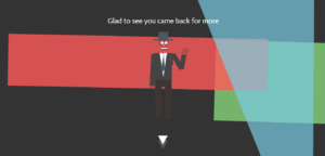
NGUMA is a dynamic website that allows users to interact directly with Boogey, the main character. The website is on auto-scroll with animations switching on its own. The main contents in the form of questions are located below.
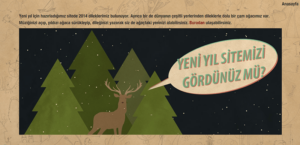
Tasarim Gezegeni is a website that develops interactive games contributing to the mental development of preschoolers. Most elements are animated including the loading page.
Merry Christmallax starts with an almost blank page that develops into a fully-illustrated page as you continue scrolling. The good thing about the website is you will see the changes as you scroll down. It aptly starts with a simple message ‘Get scrolling.’
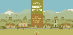
Make Your Money Matter is a promotional website that showcases the benefits you can enjoy when you join a credit union. It is like a journey wherein the user is an active participant, and the theme is alive every step of the way.
Simply, animation puts flavor to your website. Nonetheless, when exploring flat web design, make sure to make it user-centric yet minimalistic and fully-functional. This ensures a unified interface which is your website’s doorstep to a more engaging UX. After successfully doing this, it will not be a surprise your users’ appreciation of the functional nature of your website.
Now, the question is – Is a flat web design right for my company? No one knows for sure, but we shall see. We can work together and discover the possibility of a flat yet animated web design for your project. Remember flat design is a sustainable design, but it doesn’t suit every brand.
Sources: Creative Bloq | WebsiteMagazine.com | NetProfitMarketing.com | Designmodo.com


