Web design has been a dynamic and ever-evolving field, constantly reshaping the digital landscape with innovative trends and technologies. From the early days of static HTML pages to today’s immersive, interactive experiences, the web design journey reflects not only technological advancements but also changing user expectations and societal shifts.
This article takes you on a captivating journey through time, exploring the most influential web design trends from 2014 to 2025. We’ll discover how these trends have transformed the way we interact with digital content, influenced user experience, and pushed the boundaries of creativity and functionality in the online world.
Each section of this article provides a window into a specific era of web design, highlighting the trends that defined those years and their lasting impact on the digital landscape. From the rise of minimalism and bold typography to the advent of AI-driven personalization and immersive 3D experiences, we’ll explore how these trends have shaped the websites we interact with daily.
This comprehensive look at web design trends will offer valuable insights into the past, present, and future of the web. Join us as we unravel the story of how web design has continually reinvented itself, adapting to new technologies and user needs while setting the stage for the digital experiences of tomorrow.
Web design trends 2023 to 2025
Here comes a brand new year! The year 2024 has shown us web design trends brought by ever-so-variable technology. The year 2025 is no different, and these are the trends to look forward to this year.
Oversized typography
Web designers are increasingly advocating for simple designs. They are consistently on the lookout for simplistic yet impactful designs such as bold typography.
Bold, brave, loud, proud, oversized fonts are vivid, drawing attention to where they should be. An attached recall with this element makes it all the more critical to branding.
Asymmetric layouts
Grid-based techniques still work. However, broken grid layouts are becoming more important for web designers who emphasize the necessity of uniqueness.
The asymmetric layout may be chaotic but neat enough to make a website look aesthetically pleasing.
Dynamic illustration
Dynamic illustrations, including animations and even GIFs, are some web designers’ answers to videos that slow down loading times. In addition, mouseover effects and transitional elements are popular right now, and for good reasons.
Motion graphics serve a purpose without shooing away the visitors who could also be potential customers. Animation also adds character to the entire website, even emphasizing the relatability of the site. This is also good for visual storytelling.
Custom images
Speaking of uniqueness that stands out, custom images can add personality to any website. It is more for branding also, displaying the brand identity in a memorable way for the visitors.
Even when using a template, once the designer introduces custom images, no one can tell that it’s a template you are using.
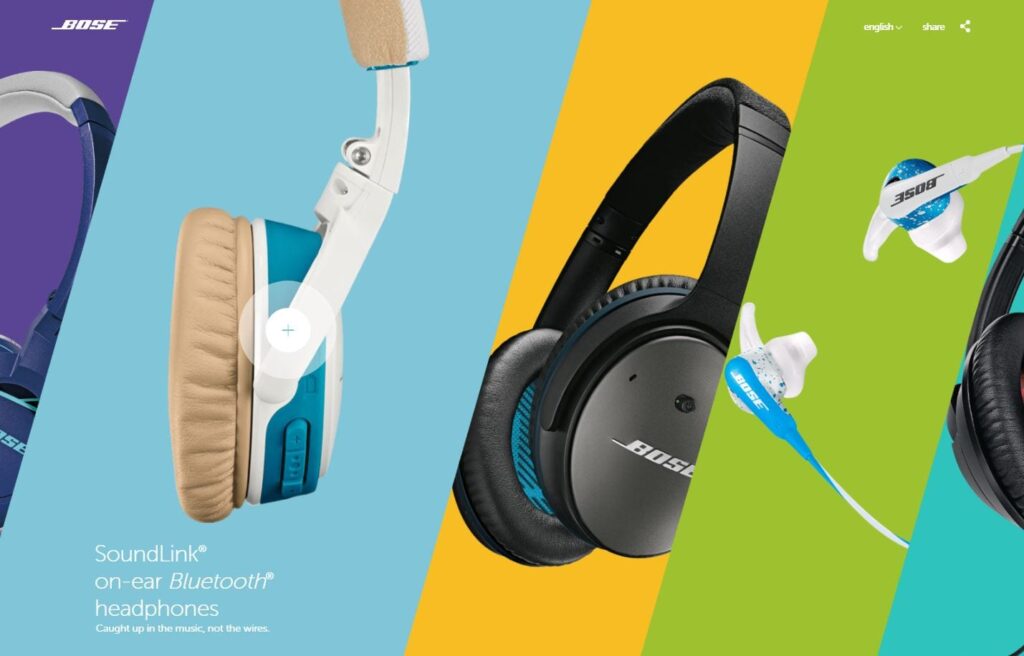
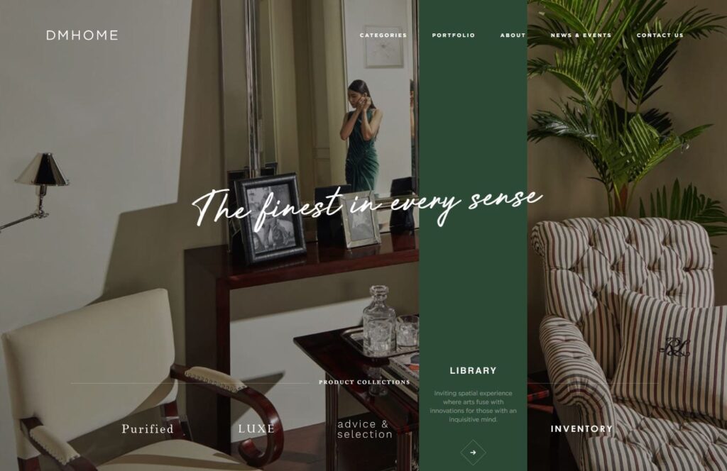
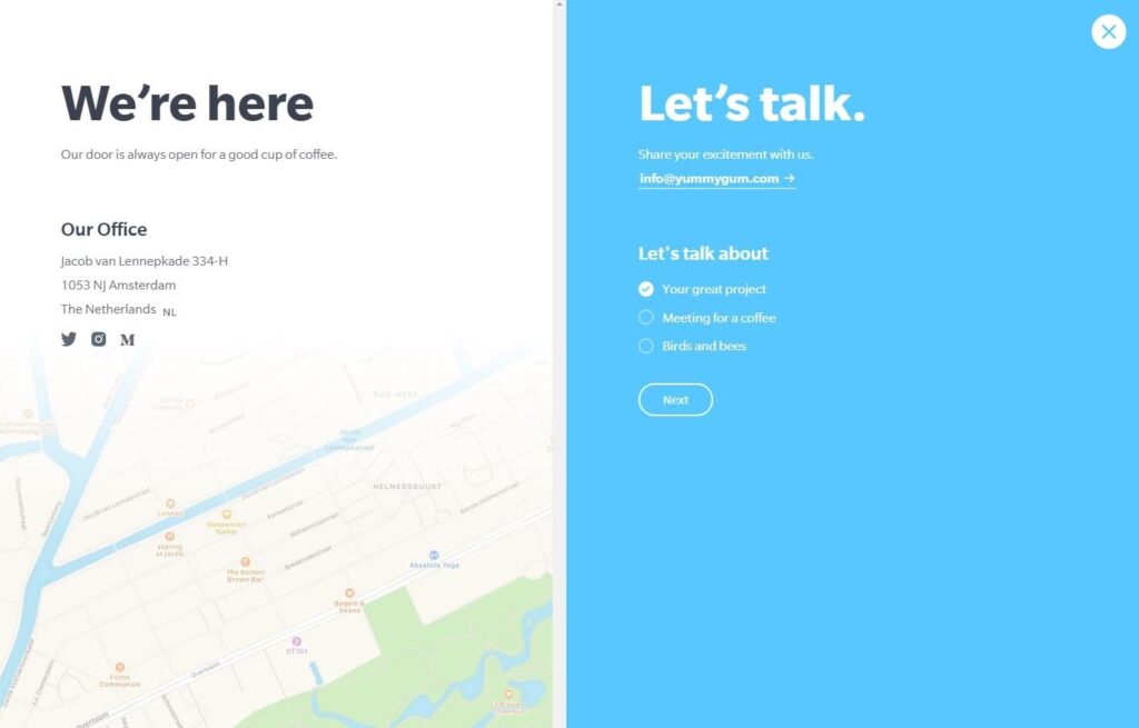
Split content
Web designers are also fond of playing with the dynamics of the real estate screen with split content. Through this, they can showcase two or more types of content without competing with one another.
Split content also makes the entire website look well-organized despite showing various content at once.
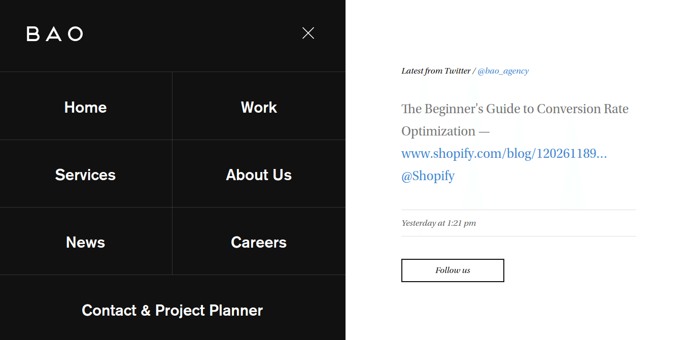
Hidden navigation
This one has minimalism as its roots, or when web designers started utilizing as few elements as possible throughout the visible screen. As a result, hidden navigation becomes a vital factor in space-saving.
Hidden navigation adds the element of surprise and increases microinteractions on the website. The last one is crucial in UX (user experience).
Full-screen forms
Web designers who prefer simplicity take it a notch higher with full-screen forms.
Once triggered, it allows the users to focus on one task at a time: filling out the form in front of them.
AI infusion
The three biggest trends of 2020 are augmented reality (AR), artificial intelligence (AI), and machine learning (ML). For the year 2021, the lingering digital marketing trends include chatbots, voice search optimization, augmented reality, programmatic advertising, shoppable content, geofencing, hyper-local SEO, social media stories, and omnichannel marketing. As such, the user interface is no longer about the traditional homepage, dashboard, or feed that users are familiar with.
With AI infusion, automation of certain elements is necessary to provide a more personalized experience to visitors. The system uses the preferences and behaviors of the users to make the experience multi-dimensional.
Machine learning integration
With the above said, ML integration is also an ongoing trend. Smart web designs that do not insult the intelligence and sensibility of the users are the emphasis.
Websites must be more targeted and contextual, so this integration is favored.
Scalable vector graphics
Web designs should also boost engagement levels, so scalable vector graphics (SVGs) become even more required today. SVGs allow for integrating multimedia content.
Responsive, mobile-first designs are anchored on mobile UX prioritization. SVGs have a role to play in this aspect because they make rich visual content a possibility without sacrificing site speed.
Voice-capable interface
Voice search is the rave right now. Web designers take heed by allowing the users to interact with the site via voice-enabled commands.
This trend is not entirely design-related. However, it is connected with the functionality and usability of the website. It is a matter of accessibility that is also essential in web design.
Web design trends 2019 to 2022
Before we embrace the newest web design trends, it is only right to list down what trends we’ve seen from 2019 to 2022. These are the trends that shaped the web development industry during those years.
Machine learning
Artificial intelligence (AI) is no longer dependent on the inputs of the programmers’ thanks to machine learning. Technically, these programs can collect and synthesize data to make them more useful. The goal is to improve the overall user experience (UX).
This will be carried over to the next year, more so that machine learning can increasingly demonstrate commonsense knowledge by simulating human empathy.
AI and bots
AI mimics human intelligence. AI-enabled communication became possible with the assistance of machines, including chatbots, virtual assistants such as Alexa, Siri, and Cortana, and voice bots.
With AI, analytics solutions are integrated as the machine performs various cognitive functions, such as collecting and analyzing data. It was also able to understand emotions by looking contextually into intent.
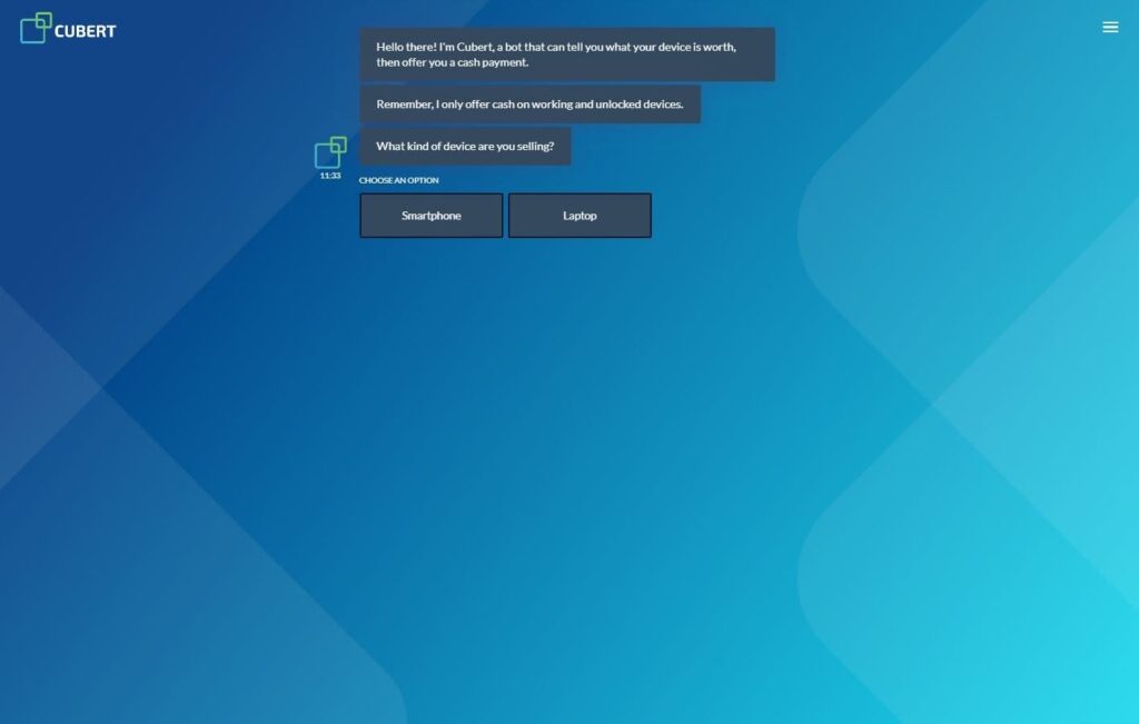
Chatbots
Chatbots are instantaneous, so more and more users are interacting with them. It was predicted that 85% of consumers would use chatbots to reach out to the brand. As an extension of customer support in real-time, chatbots users see today are more intelligent and efficient.
The difference is the higher customization levels that are not apparent in the past chatbot iterations. For one, modern bots have personable faces, and brands try to use mascots for representation.
AI integration was the single most important application in 2020 and the next years based on the extent of its use in 2019.
Voice search
In 2019, users witnessed how some websites were optimized for voice search. Google alone reports up to 35x increase in voice search queries. Thus, in 2020, voice search queries will account for 50% of the total number of queries, especially on mobile searches.
This only means that users are comfortable with the new technology, so continued use is expected. This is not just for a better user experience; voice search optimization also leads to higher ranking, increased traffic, and, thus, better user acquisition.
API-first
Technology support has also seen tremendous growth in 2019. Voice search recognition API is just one availability in web-enabled devices that programmers should capitalize on now and for several years to come. Streamlining is apparent in various aspects of our lives, from wearable tech to smart homes.
With API-first design, we’ve seen developers who start with an API and build from there. This also achieved seamless integration between the front-end and back-end developers.
AMP and PWA
Accelerated mobile pages (AMP) and progressive web app (PWA) became instrumental in achieving 2019 speed goals, among others.
AMP targets developing websites that load quickly on mobile devices without sacrificing features such as videos, graphics, illustrations, and animations. AMP-powered pages load on multiple platforms, devices, and browsers. And while there are inherent HTML restrictions that result in functionality restrictions, the benefits of AMP are undeniable.
PWA, on the other hand, are web apps that load like regular pages but with higher levels of functionality. They load almost instantly because of content prioritization minus the cache issues. Building with progressive enhancement, this trend will continue in 2020 and beyond.
Motion UI
Since higher levels of interaction are in demand, especially among Gen Z users, motion UI (user interface) has been fully utilized because of its dynamic graphics and animation and how it impacts usability.
Motion UI is especially useful since visual storytelling was the mantra this year and probably in the future. A coherent narrative experience is essential in building the brand and brand loyalty. With it, users are kept engaged as they explore the website.
Various tools and techniques are at the disposal of the technicals, making the exploration of motion UI even more plausible. There’s a sustainable library that even technicals with no solid JavaScript foundation can use.
Ambient design
The technicals and creatives are looking for ways to keep the users engaged while highlighting the need for fresh designs. Web designs are now dependent on certain factors, such as time of day and weather conditions.
Ambient design elements increased in popularity in 2019 and will continue to be so in 2020.
Dynamic illustrations
Videos are a tough sell because they slow down the loading times. The creatives, therefore, had to look for ways to avoid video as much as possible without sacrificing the quality of UX.
In 2019, animations and integrated GIFs, as did dynamic illustrations, became big. Motion graphics were the answer, and they will still be in 2020, especially since they contribute to strengthening the brand.
Microinteractions
Microinteractions are elements that aim to humanize the site exploration experience. A microinteraction happens when a user takes action while on the website or app to which it will respond to.
These elements bring interactive experiences to a higher level with simple hovering and scrolling. This is how websites also get the users involved while they transmit information in the subtlest manner possible.
Since microinteractions are not intrusive like other elements despite making each page smarter than before, it is safe to assume that this trend will be carried over to the next year.
Thumb-friendly nav
Mobile browsing has already overtaken desktop browsing. As such, the mobile navigation design is becoming more thumb-friendly.
Mobile users hold their devices quite differently, and the thumb is prominently used. Thus, the thumb movements are integrated into the web design process of 2019 and 2020 will not be any different.
In 2020, websites will be designed to be tailored to the thumb.
Augmented and virtual reality
Augmented reality is commonplace nowadays. It has been especially useful in the e-commerce industry, taking advantage of the built-in features of devices like smartphones.
The same goes for virtual reality, which is easier to produce. And in 2019, virtual reality ushered in innovative, smarter websites.
Cybersecurity
Hacking, data theft, and other threats have always been an issue. In 2019, more profound ways of defacing websites were found. Cybercrimes are at an all-time high.
Cybersecurity was escalated this year, strengthening systems that protect information, servers, and databases. With AI, this had been possible—through robots that detect and attack the problem as it occurs and not when the damage was already done.
This is one trend that will surely exist in 2020 and beyond. Not to mention, more and more websites will adopt the zero trust security model or a security concept that requires verification on all users trying to connect to the system. Biometrics is one example.
Web design trends 2017 to 2018
In 2016, we’ve seen some of the most fascinating web design trends, from hero images to non-traditional navigation.
True enough, design evolves continuously. And more and more, each stage of evolution revolves around form, function, and UX.
That’s the idea; for a web design trend to become and remain relevant, it must tie the aesthetics with usability. Otherwise, it’ll just be another fleeting trend.
The year 2017 is no exception. So expect to see more of the following web design trends this year and perhaps in 2018 and beyond.
1) Ultra-responsive design
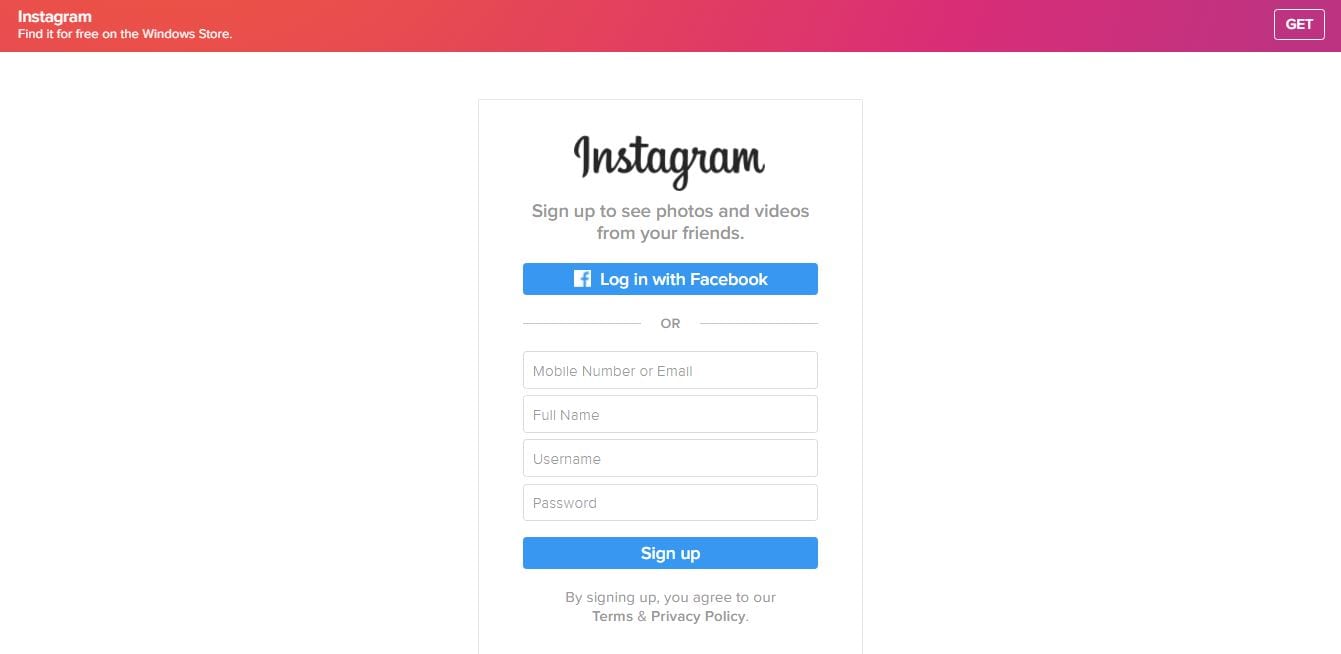
Image screenshot: Instagram
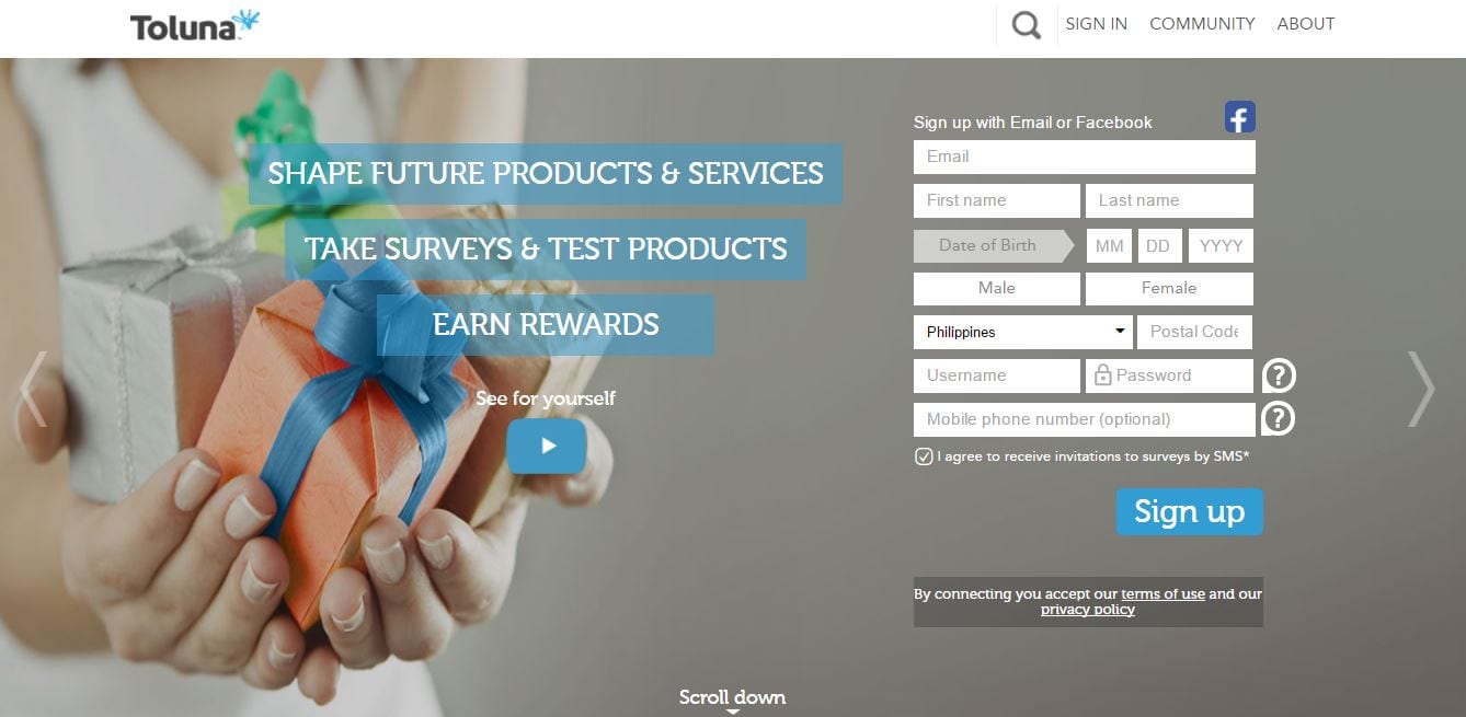
Image screenshot: Toluna
A nice-looking, fully functional website deserves to be seen on a plethora of browsers and devices. Hence, responsive design will be a staple of web design.
Responsive is becoming more responsive, tapping on the users’ demographics. For instance, a website renders a simplistic user interface for beginner-level users or with bigger fonts for older users.
Metadata is responsible for this. It allowed demographic-specific adaptation and based the site features on a distinct segment of users.
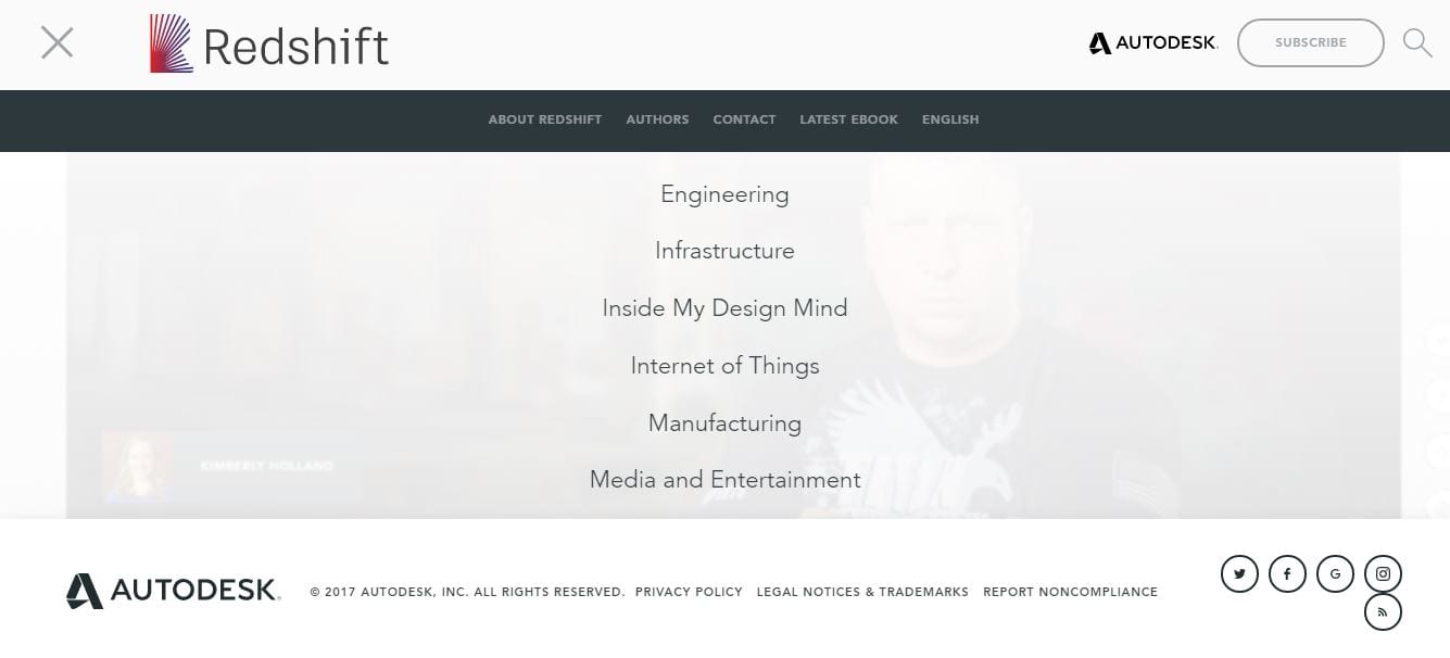
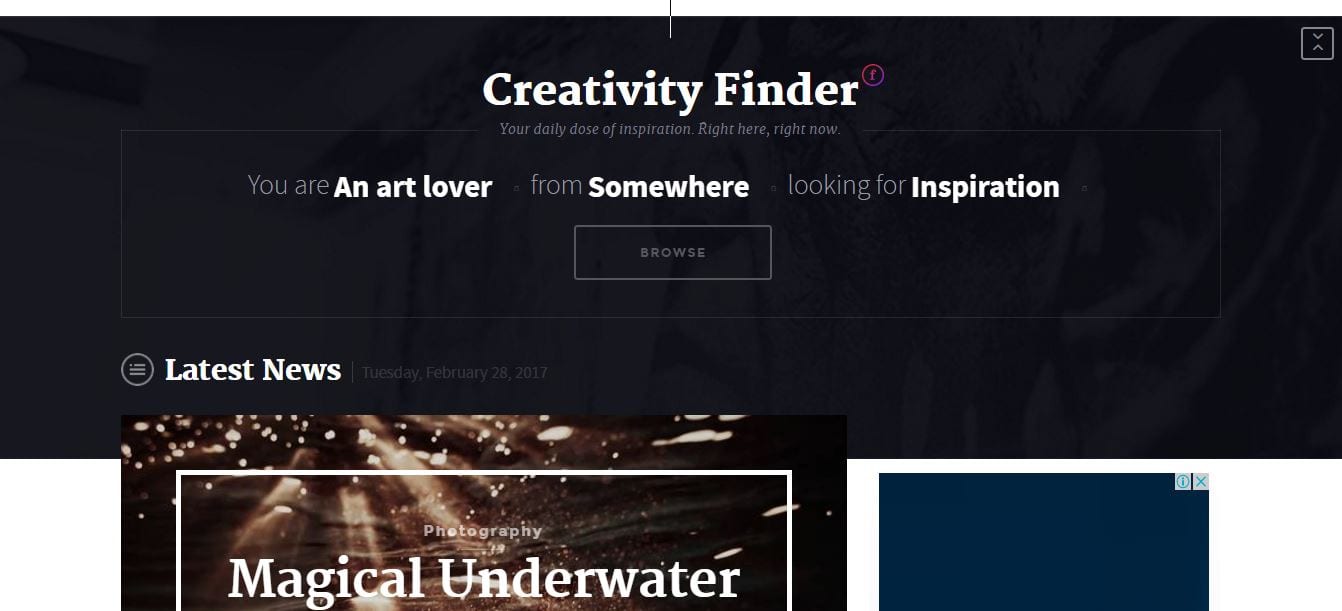
2) Conversational interfaces
Image screenshot: Redshift
Image screenshot: Fubiz Media
Conversation is an interface of its own. At least, that’s the pervasive idea in 2017.
In an era of machine learning, the present and future of design harness intelligent interfaces that permeate UX. In a way, websites are becoming more personalized, and this smart personalization makes these sites sticky.
Part of this is the practice of emotional design. The emphasis is on the emotional relationship between humans and machines rather than being rational. Such design respects human emotion, not exploit it.
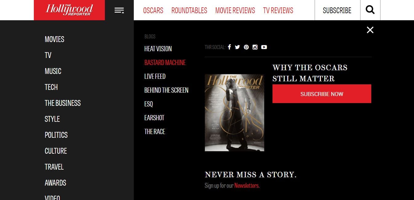
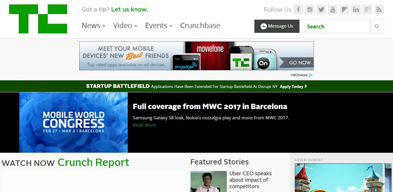
3) Micro-interactions
Image screenshot: The Hollywood Reporter
Image screenshot: Techcrunch
Micro interactive elements were first seen in 2015. It gained popularity ever since simply because the interactions empower the users in a way. A user needs to perform a task by clicking the like button. That’s it.
Every day, we see several micro-interactions, especially on Facebook and Twitter. Some interactions are too small to even notice.
On websites, the interactions are divided into small segments so that the user can easily digest them in. In this way, he or she may choose which actions to interact with. This includes parallax adoption or the movements of specific elements as you scroll down or move right or left.
4) Custom-made illustrations
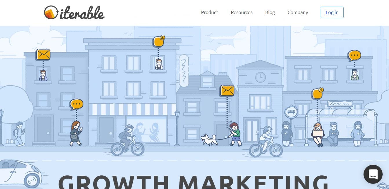
Image screenshot: Iterable
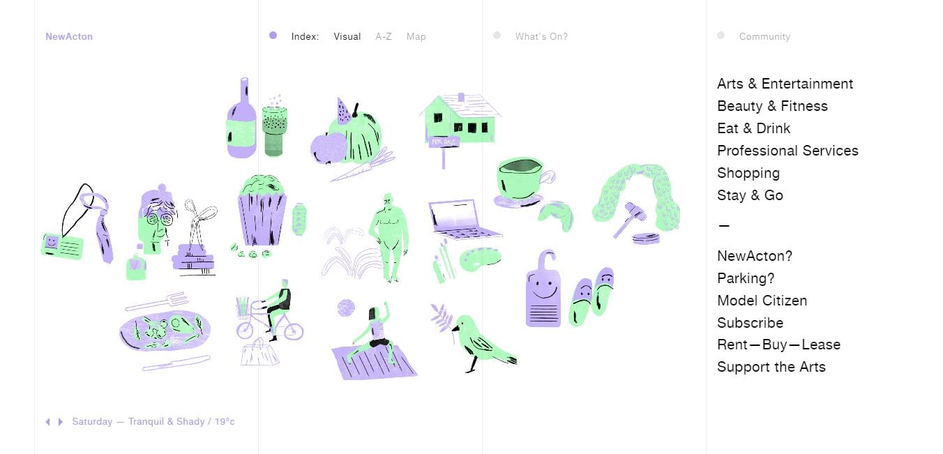
Image screenshot: NewActon
Visual messages are more powerful than textual ones. That’s what we’ve learned in the past two years or so.
Although we still see newly created websites with stock photos, we have also witnessed a tremendous increase in the use of hand-drawn illustrations.
Custom illustrations are more expensive but more unique and have better recognition value than stock images.
5) Big, bold type
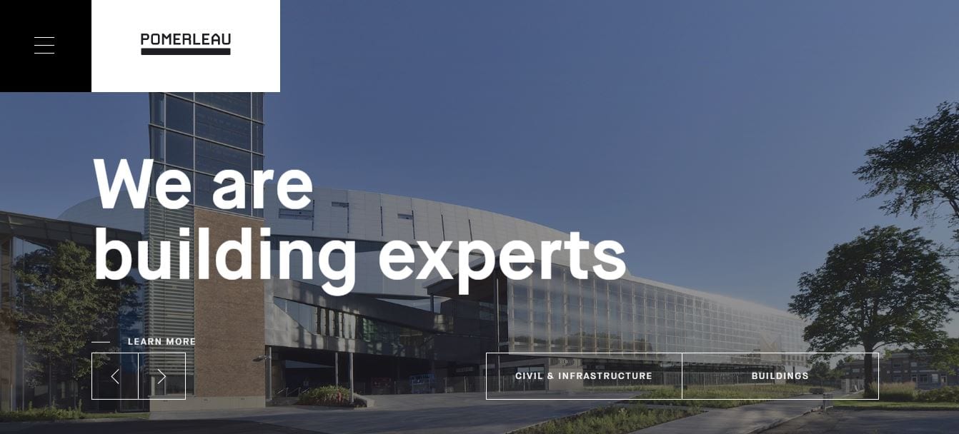
Image screenshot: Pomerleau
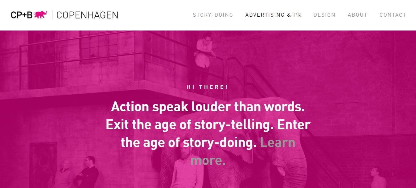
Image screenshot: CP+B Copenhagen
Content is the focus now more than ever. And some designers are finding ways to make a statement figuratively and literally.
It doesn’t necessarily concern the font, although it still matters for UX purposes. Instead, it is all about summarizing the overall value (unique selling proposition) of the brand itself.
Statements that are clear and concise, the more straightforward the message, the better.
6) SVG utilization
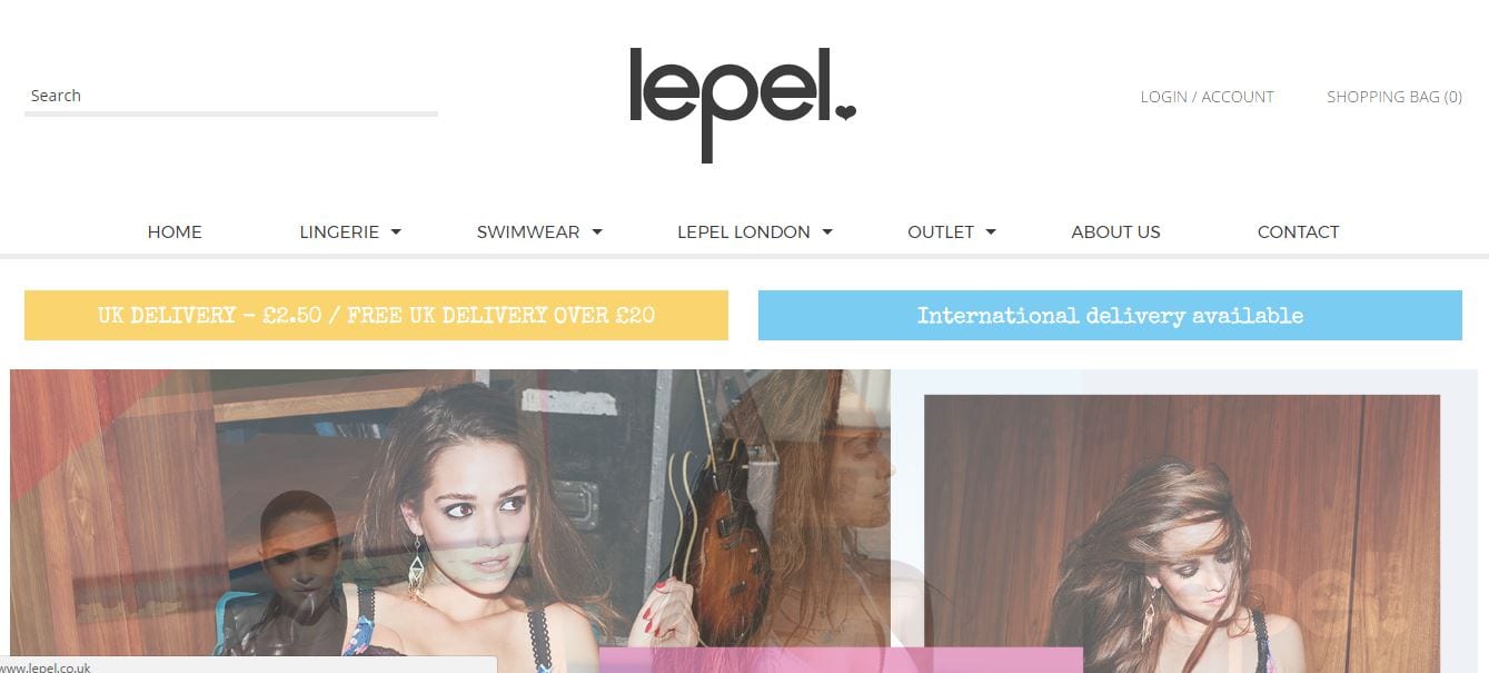
Image screenshot: Lepel
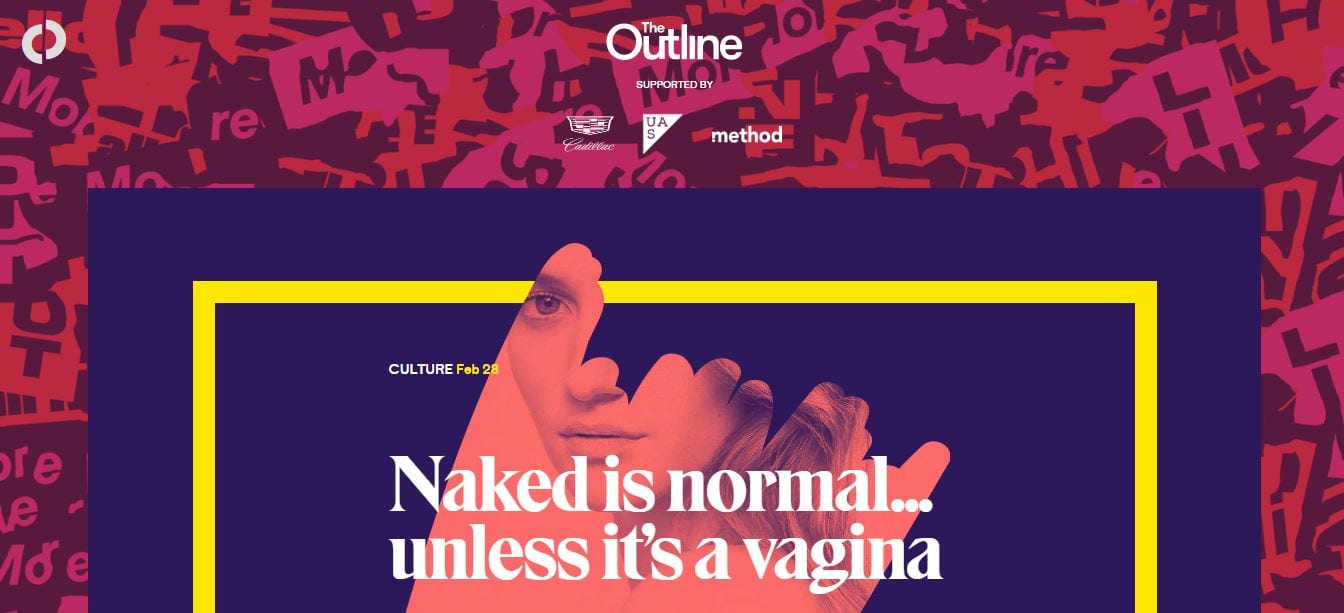
Image screenshot: The Outline
Traditionally, web developers use JPG, PNG, and GIF image formats. The problem with this is that the images are rendered with a loss of quality.
Here comes SVG or scalable vector graphics. There are two advantages to SVG: vector and scalable. This means that the image will not be pixel-based; hence, it will not be dependent on any resolution. It will render beautifully on any screen or device with lossless quality. You can even animate the images.
SVGs do not involve HTTP requests. These won’t slow down your website. That’s another plus!
7) More, brighter colors
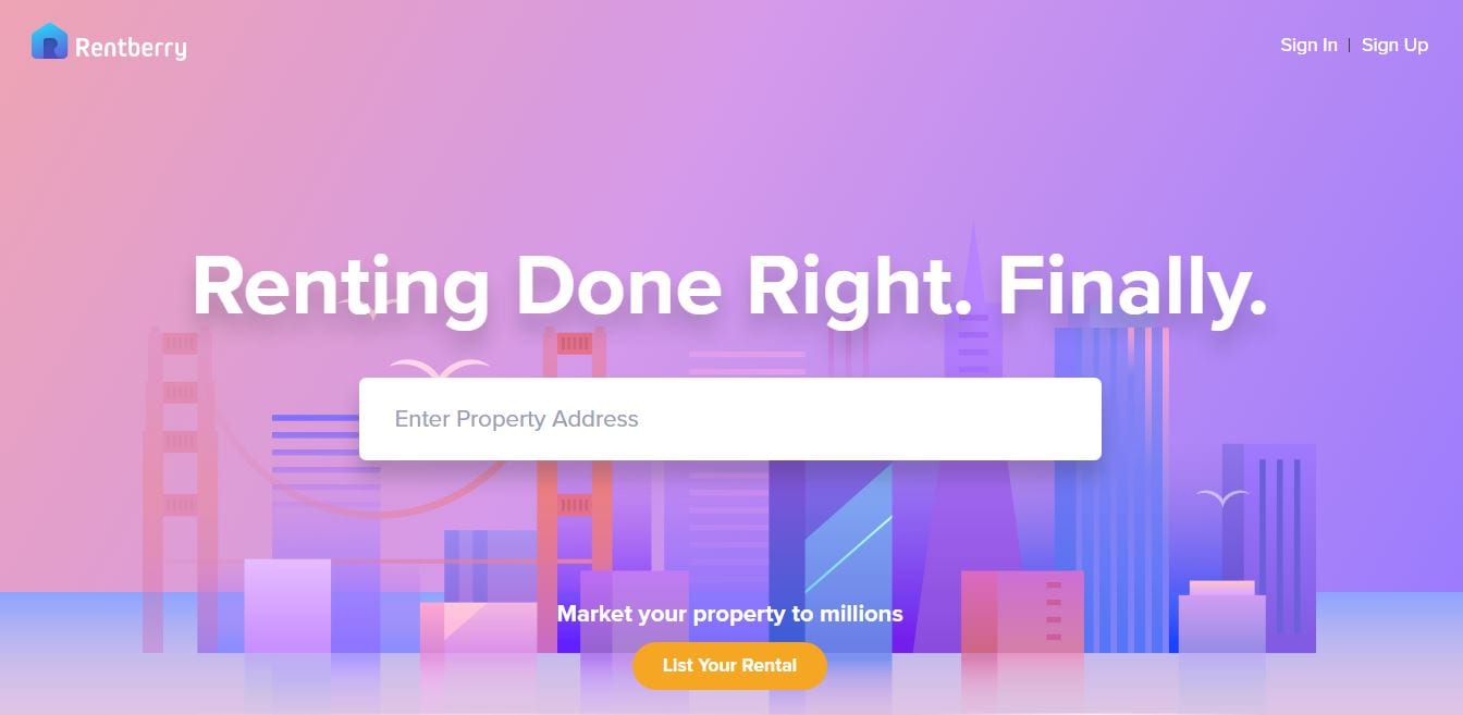
Image screenshot: Rentberry
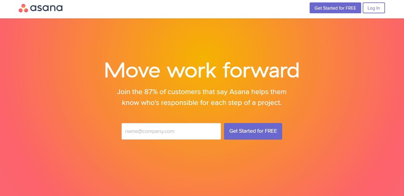
Image screenshot: Asana
As per the client’s requirement, designers are looking for ways to develop websites that imbibe the right personality. The challenge is doing this with minimalism in mind.
Drenching the site in branding-appropriate colors is the solution. Lively colors that blend and blur and are lenient to spectra that appear naturally are the in thing this year.
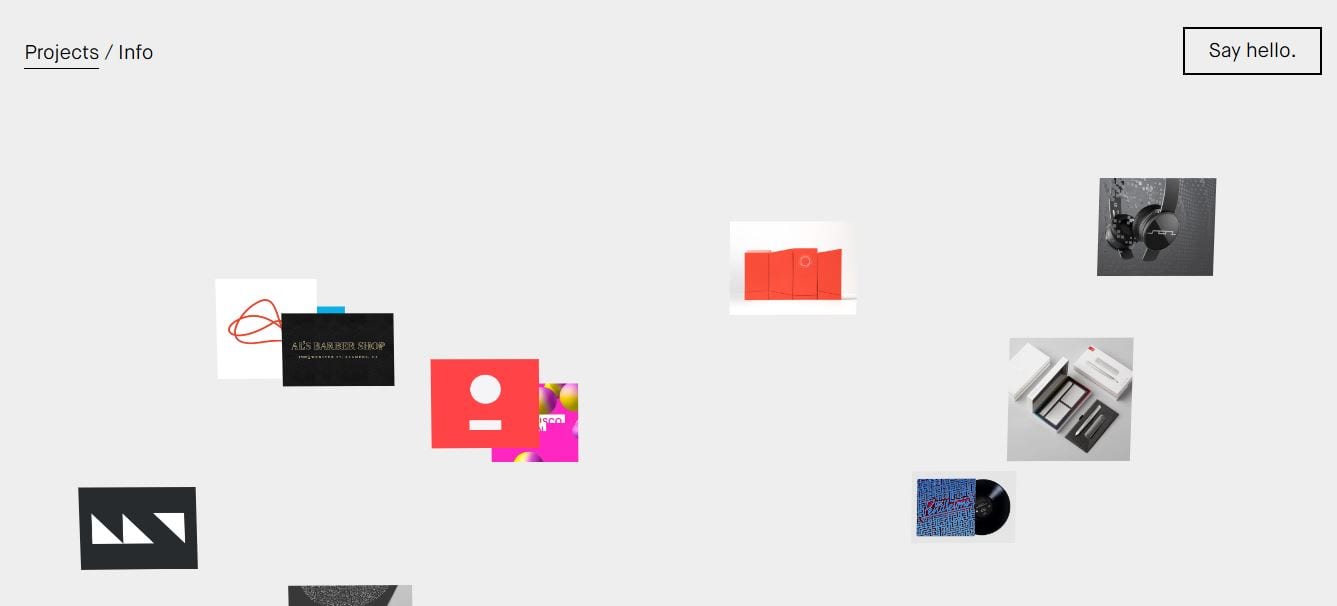
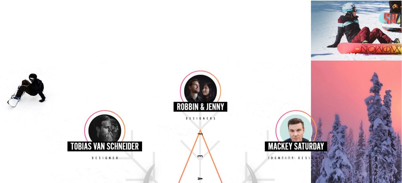
8) Unique layouts
Image screenshot: ISaidICanShout
Image screenshot: Epicurrence
In the sea of brands, the need to stand out is even more pronounced today. That’s why the creatives are constantly thinking outside the box.
The result? Websites that are not too boxy, quite literally. Put simply, the visual presentation of content is not like what it was before—the navigation bar or menu is either at the top or on the left side pane of the screen.
Navigation design is more diversified nowadays because of MLP or minimum lovable products. Although unorthodox elements are present, the design quality must be able to communicate credibility instantly. It must be transparent enough so the website can build ongoing trust.
9) Geometric patterns
Image screenshot: BuiltbyBuffalo
Image screenshot: BeVisionare
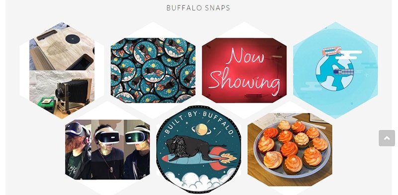
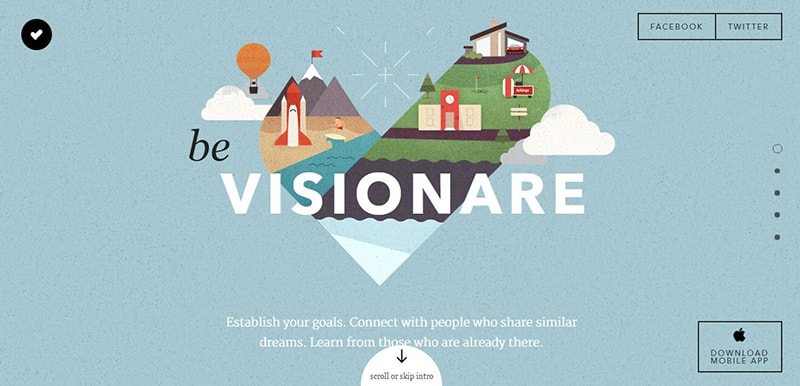
Geometric shapes and patterns never go out of style, but not this year, definitely. The reason behind is the versatility of these elements. It is one way to look at fat design from a new perspective.
Apparently, there are infinite ways to integrate geometric elements into design—from using shapes around an image to using lines on the borders especially on the above the fold content.
Although the goal is to incorporate a heavy geometric design, this must be approached with caution. Going overboard about it won’t do any website the justice it deserves.
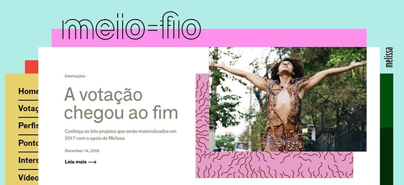
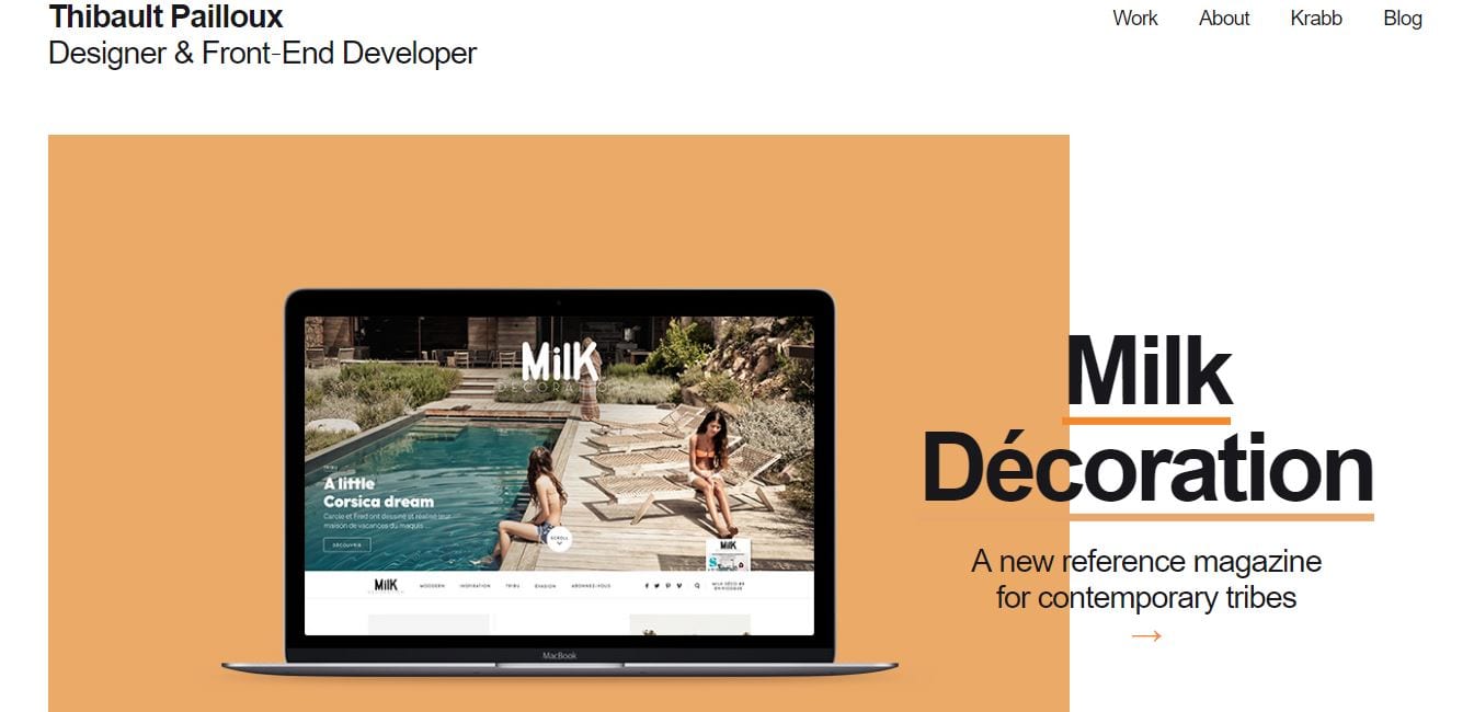
10) Imaginative mastheads
Image screenshot: Meio-Fio
Image screenshot: ThibaultPailloux
In 2015 to 2016, we’ve seen the scrolling navbar, and we still see it. Nevertheless, mastheads are becoming more creative.
It is a way to make your brand stand out from the rest of the competition for branding purposes. Websites can even go without a masthead if the owners want. Go nontraditional if the mantra today.
Again, it’s because the emphasis is on the content, wherein the homepage is designed as a landing page. The pages are strictly built to cater to the needs of the users, and the masthead (or the lack of it) often serves as the anchor.
Based on this, we will see some of the best design trends to date in 2017. What’s good about these designs is the emphasis on humanizing the websites—a win for all users!
Web design trends in 2015 to 2016
As dynamic as it is, the design should be able to accommodate form and function. Designs evolve. Trends come and go, and that may be attributed to the ever-changing nature of design. One aspect that will never go away is UX.
In connection to this, here are some web design trends this 2016 (with examples for each) that are worth exploring. These design trends remain relevant because they are geared towards perfecting the user experience.
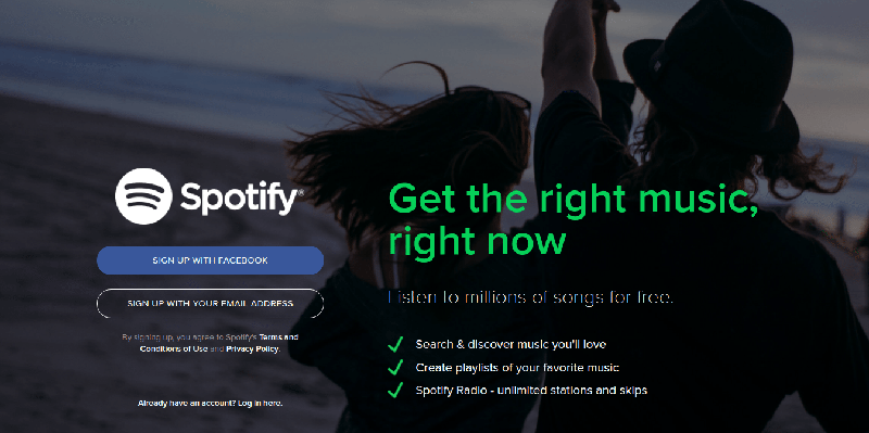
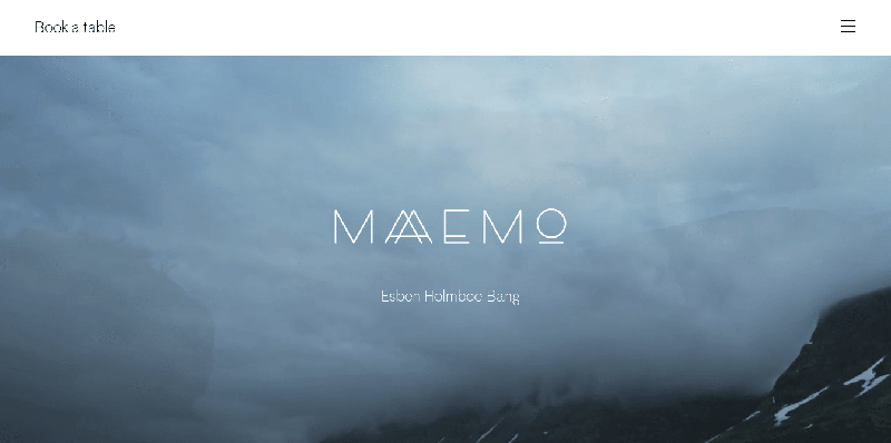
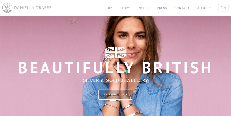
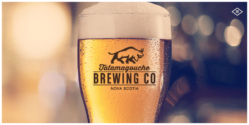
1) Hero images
A striking, high-definition image is enough to capture the attention of any user. This trend capitalizes on the strongest human sense – vision. Combined with compelling calls to action and conversions will inevitably increase.
Image screenshot from: Spotify
Image screenshot from: Maaemo
Image screenshot from: Reminder Media
Image screenshot from: Daniella Draper
Image screenshot from: Tata Brew
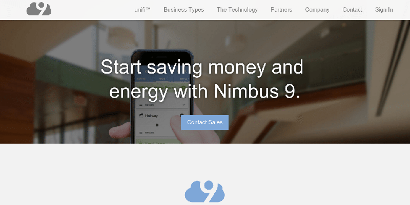
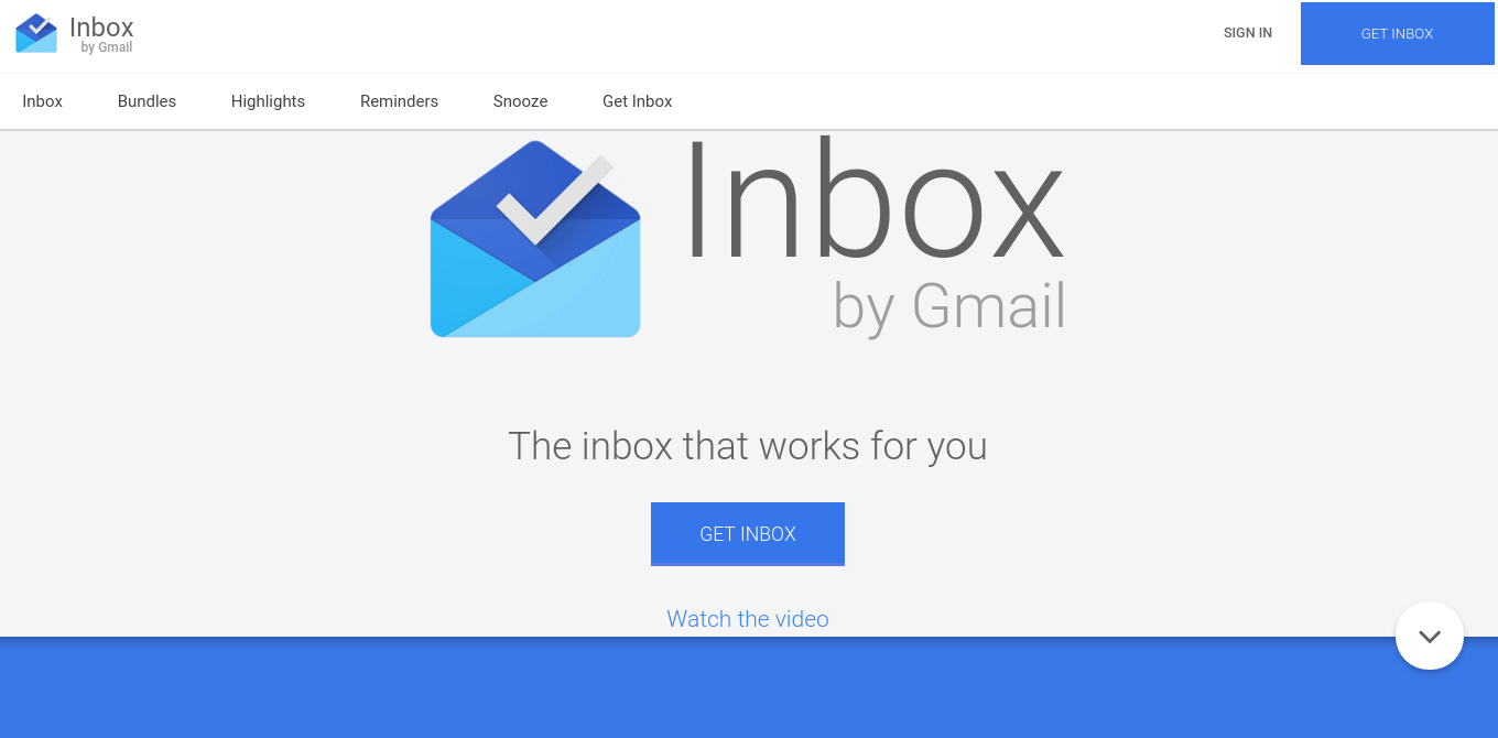
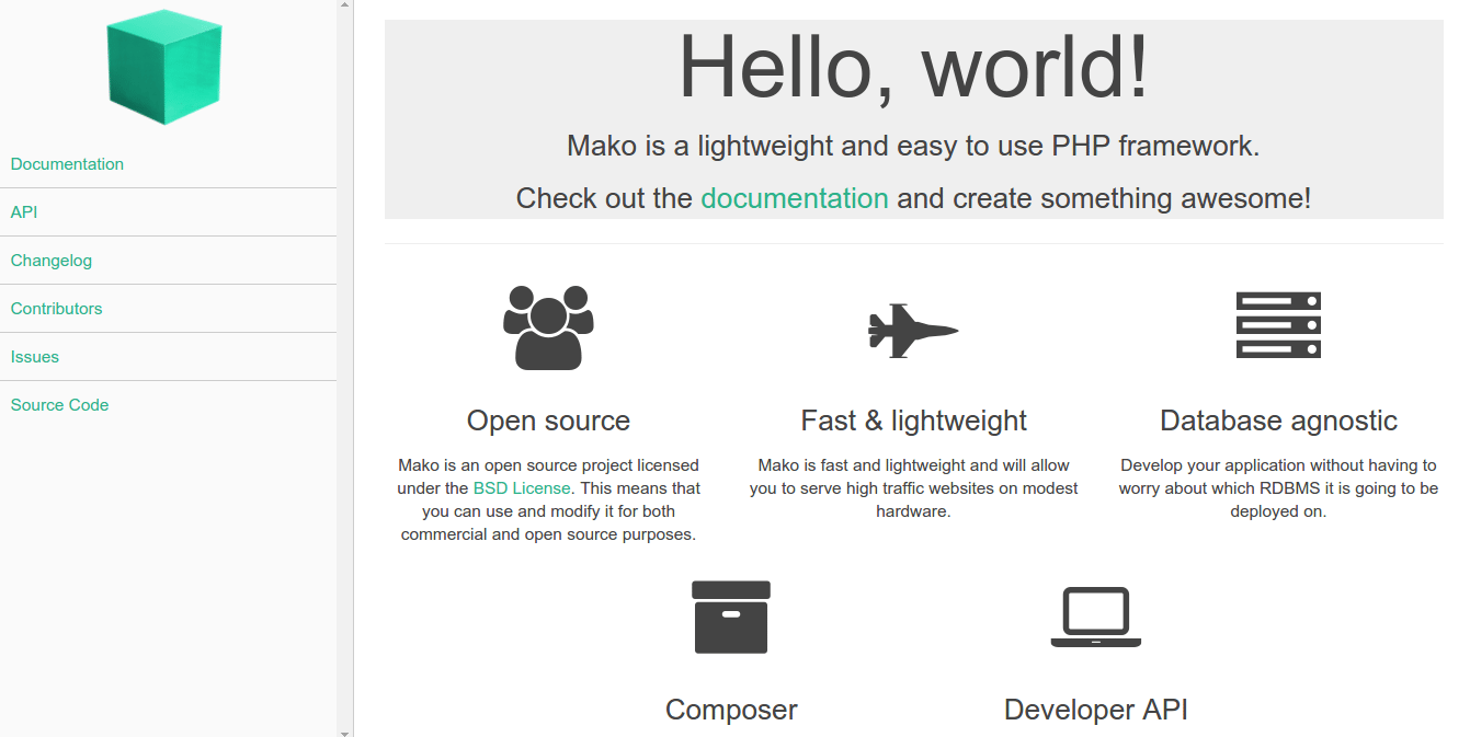
2) Material design
Flat design’s next dimension, material designs gives more depth through grid-based layouts, responsive animations, and of course, light and shadows. Also called Flat Design 2.0, the design aims to showcase the layered feel which is more realistic and more intuitive to the users.
Image screenshot from: Nimbus 9
Image screenshot from: Google Inbox
Image screenshot from: Mako Framework
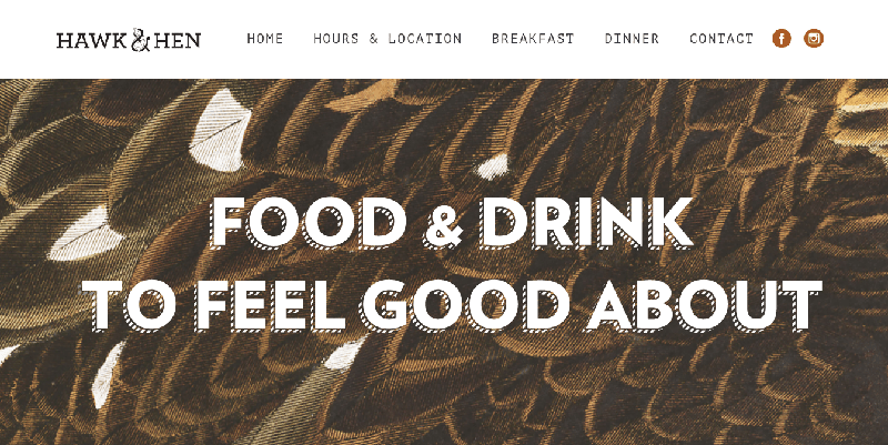
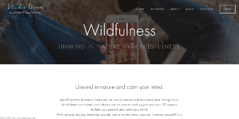
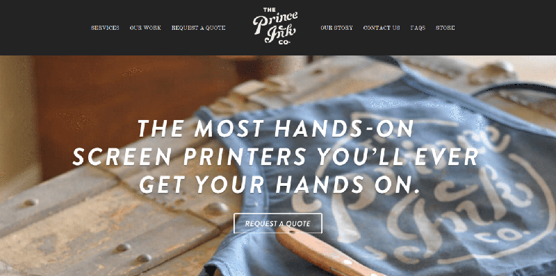
3) Elegant typography
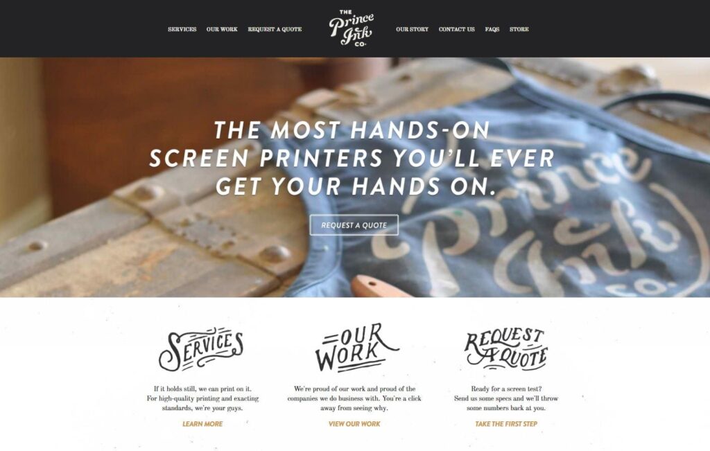
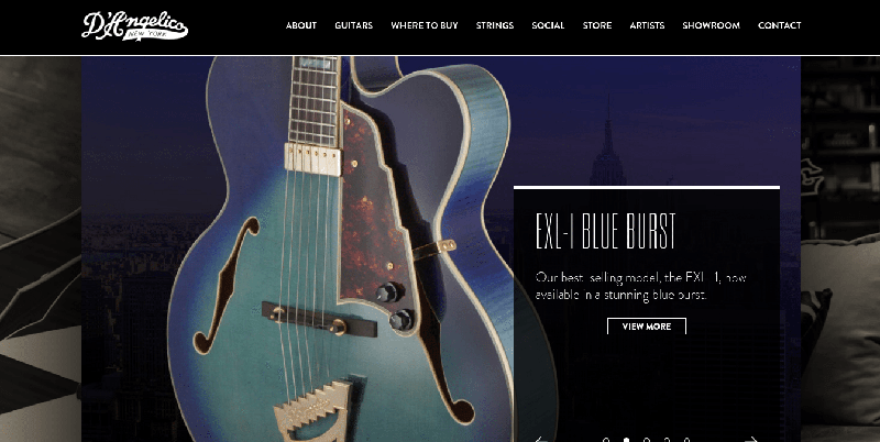
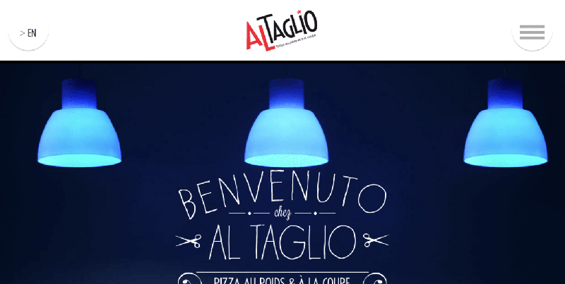
To highlight the minimalist design, dramatic and impactful typographies are becoming the standard. In fact, today is considered as the golden age of typography thanks to the availability of web type tools such as Adobe Typekit and Google Fonts. These artistically streamlined calligraphic fonts actually feel more personal. And, they are tangible enough to sustain the browsing experience. It’s a visual hierarchy tool that is also ideal for branding purposes.
Image screenshot from: Hawk and Hen
Image screenshot from: Studio Brun
Image screenshot from: Prince Ink
Image screenshot from: D Angelico
Image screenshot from: Al Taglio
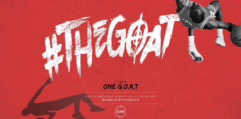
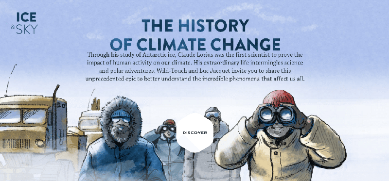
4) Rich animations
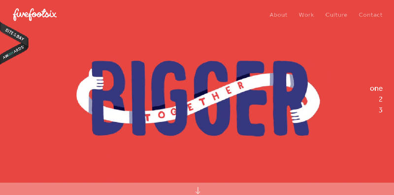
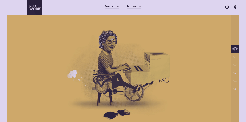
Background, hover, and motion animations add visually interesting dimension to any website. They make a website more lively and engaging. Background animation, nonetheless, is used in moderation as it can be distracting to the users. The browsing experience should remain simple, intact and uninterrupted. Gentle movements of an image that aim to enhance the content of the page will do. The focal point here is bringing the attention of the user to elements that deserve such attention. Animations, regardless of the type, should be seamless and cohesive, though.
Image screenshot from: Five Foot Six
Image screenshot from: Leg Work Studio
Image screenshot from: NBA Face Off
Image screenshot from: Ice & Sky
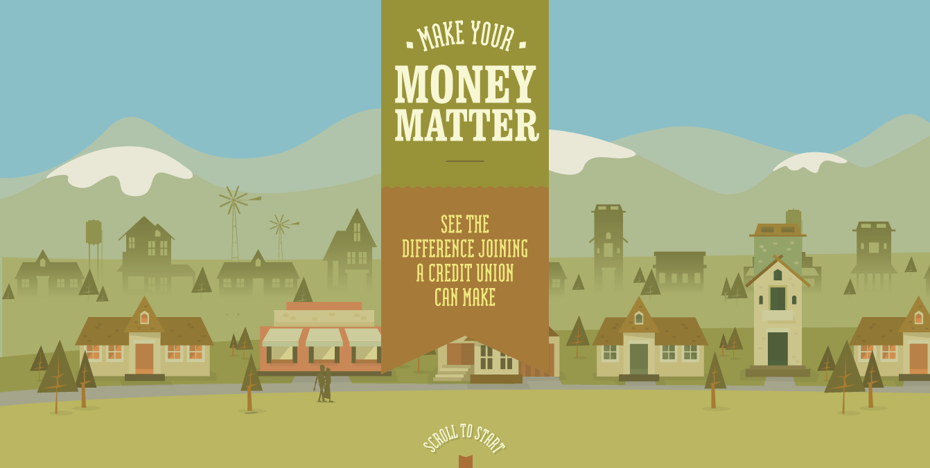
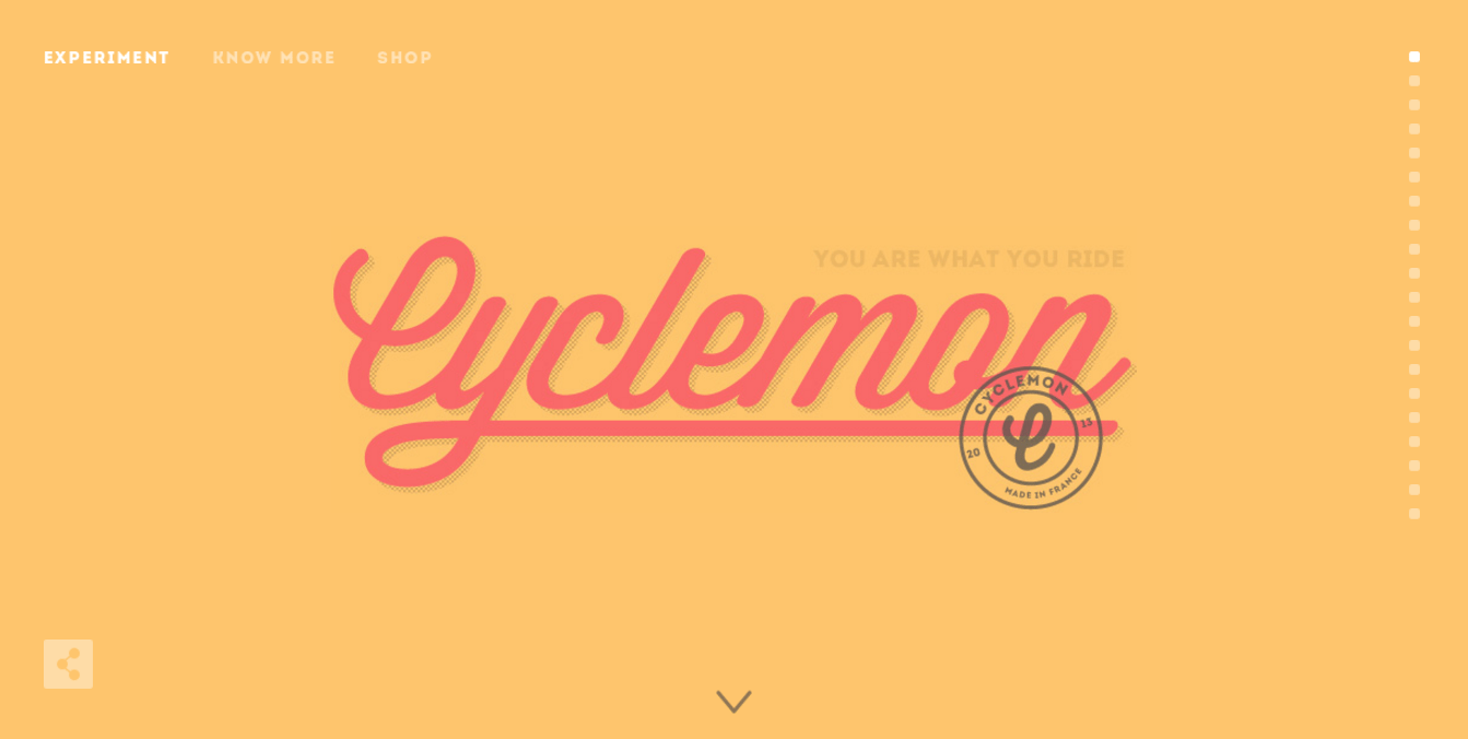
5) Infinite scrolling
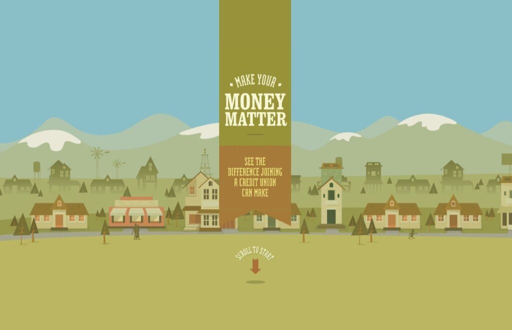
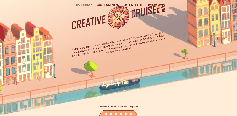
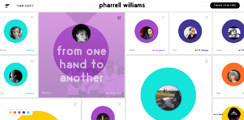
Single page websites are still popular nowadays since it is a storytelling opportunity. While the central element is the long, smooth scroll navigation, there is the element of pace control wherein the user may stop scrolling if he wants to. There is also the element of surprise integrated into the experience which makes the scrolling process itself more engaging.
Image screenshot from: Make Money Matter
Image screenshot from: Cyclemon
Image screenshot from: Creative Cruise
Image screenshot from: Pharrell Williams
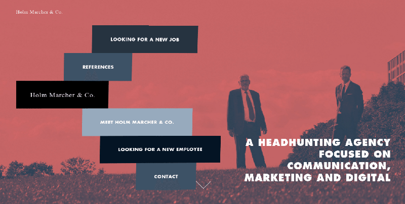
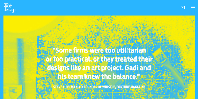
6) Duotone schemes
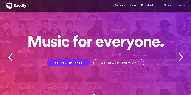
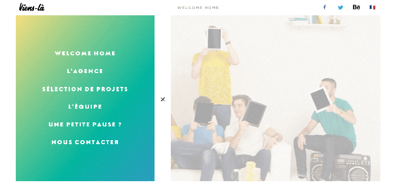
In creating a strong visual impact, duotone color scheme can do just that. Bright colors in larger palettes are the ‘in’ thing right now. The more vibrant the colors, the better. Colors should be complementary, however; otherwise, it will defeat the purpose of synergism. These schemes are best for minimalist websites since the gradients can highlight the content entirely.
Image screenshot from: Spotify
Image screenshot from: Viens La
Image screenshot from: Holm Marcher & Co.
Image screenshot from: New Deal Design
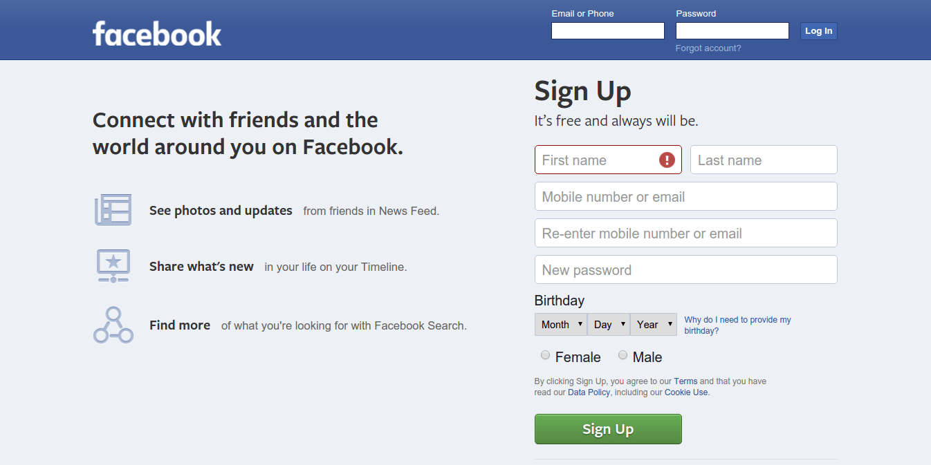
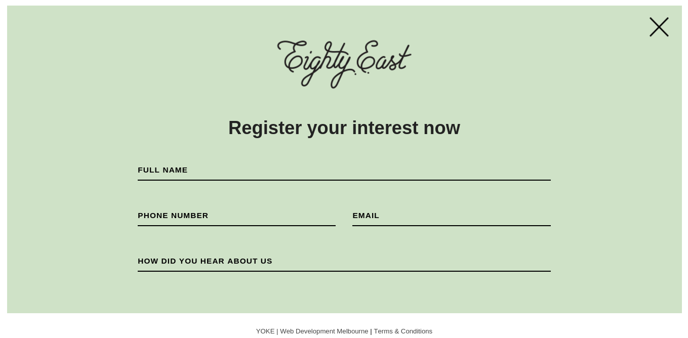
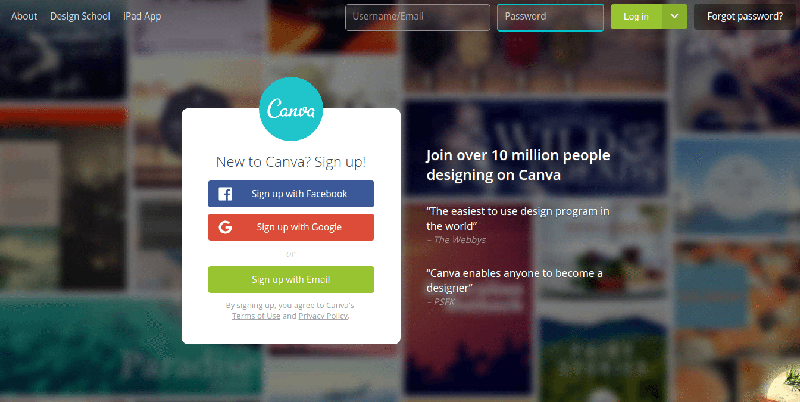
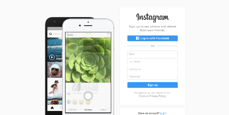
7) Fullscreen forms
Multi-device use influences the sizes and formats of forms to display on the screen. It can be a fullscreen form or an overlay, allowing for a legible space. With a single screen to focus on, it would be easier for the users to interact with such.
Image screenshot from: Facebook
Image screenshot from: Eighty East
Image screenshot from: Canva
Image screenshot from: Instagram
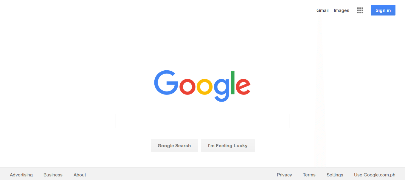
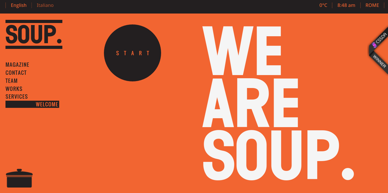
8) Minimalist design
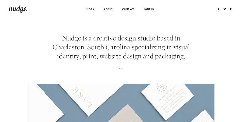
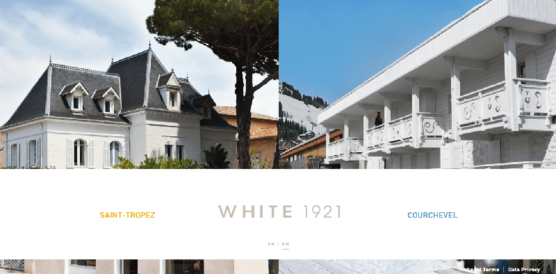
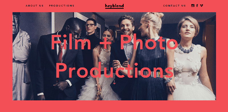
Minimalist sites continue to populate the interweb. Apart from highlighting the content through at-a-glance understanding of the entire page, the visual layout strips away distractions. It leads to a more sophisticated website due to the logical fit of colors, contrast, and typography. Increased legibility is also achieved through an ample amount of negative space.
Image screenshot from: Google
Image screenshot from: Soup
Image screenshot from: Studio Nudge
Image screenshot from: White 1921
Image screenshot from: Heyblend
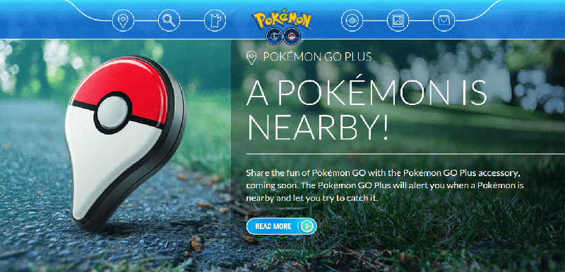
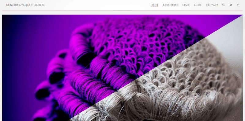
9) High-definition visuals
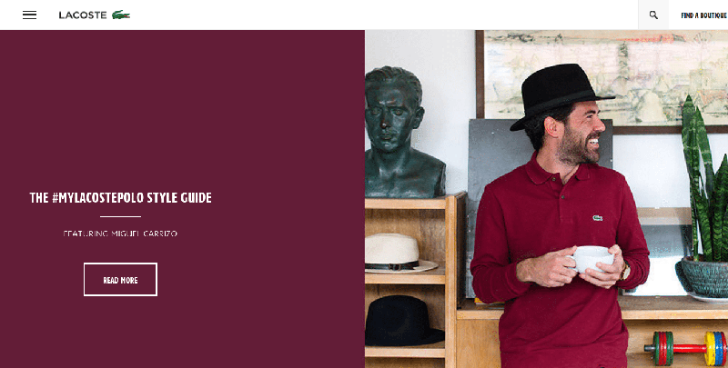
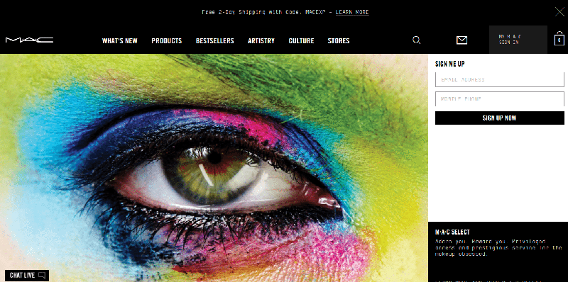
A high-definition design is the rave these days. Thus, it is only natural to use HD visuals to complement these designs. Rich graphics, compelling photos, and captivating videos all form part of HD visuals. These elements increase a user’s dwell time (or the time she spends on the website) as they create and shape the overall mood of the desired experience.
Image screenshot from: Mac Cosmetics
Image screenshot from: Lacoste
Image screenshot from: Pokemon Go
Image screenshot from: Derwent & Tamar Chambers
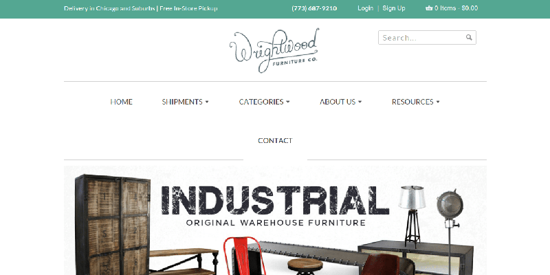
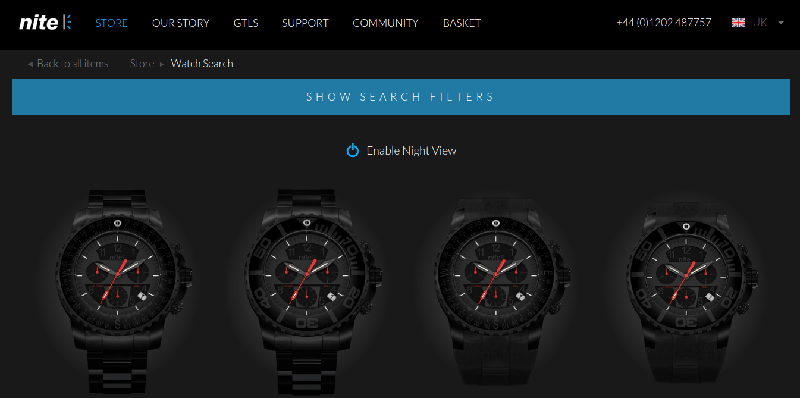
10) Microinteractive elements
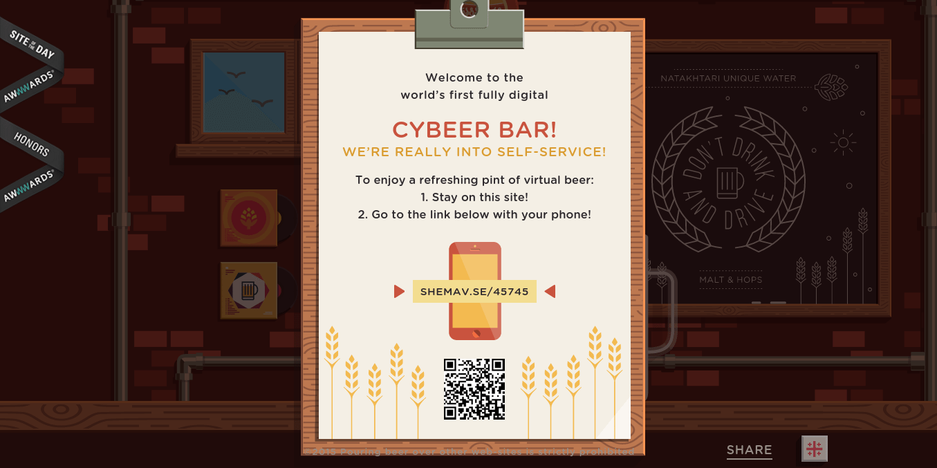
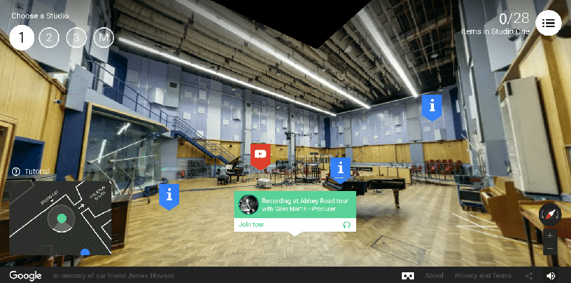
Microinteractions are becoming more crucial for websites. These allow for a more fulfilling browsing experience, shaping and teaching the users on how they should actually interact with the website. These engagements are non-intrusive and would not require significant actions from the users. Interactions can be branded and non-branded, too.
Image screenshot from: Wrightwood
Image screenshot from: Nite Watches
Image screenshot from: Cybeer Bar
Image screenshot from: Abbey Road Studio
Image screenshot from: Beatbox Academy
11) Illustrations
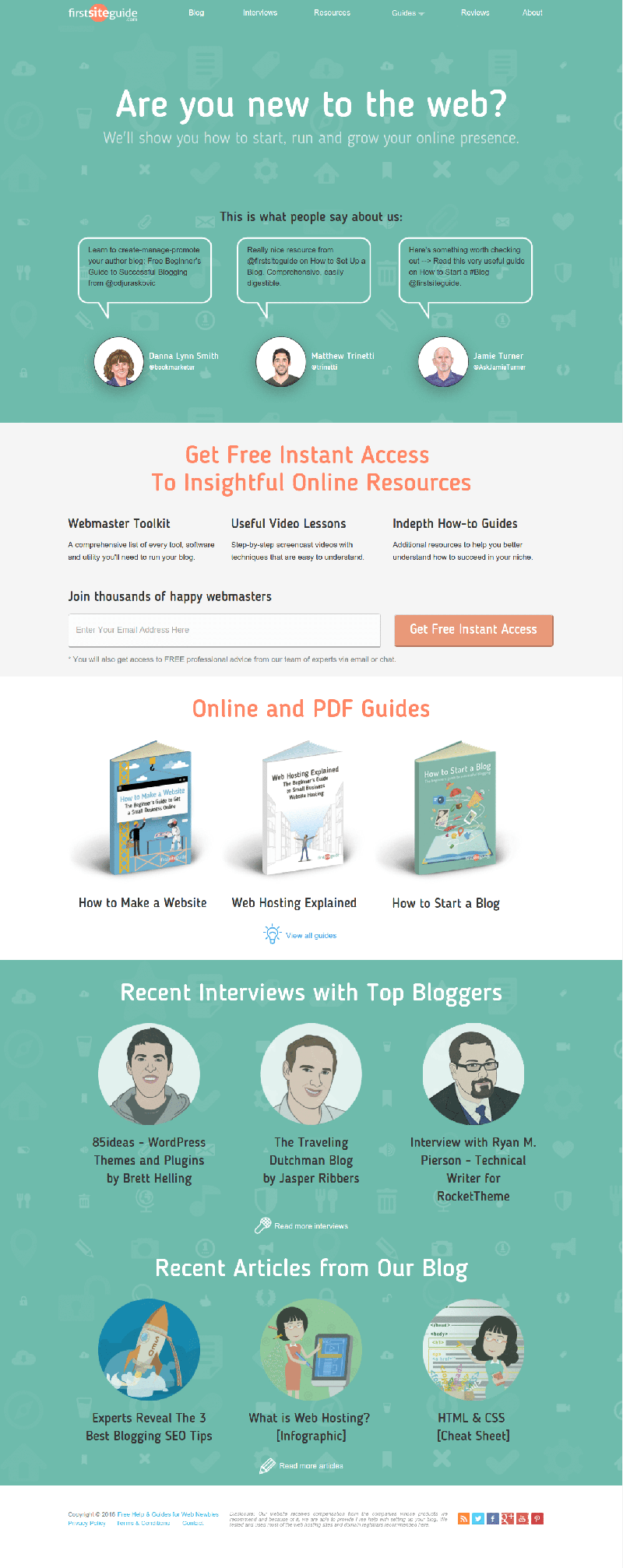
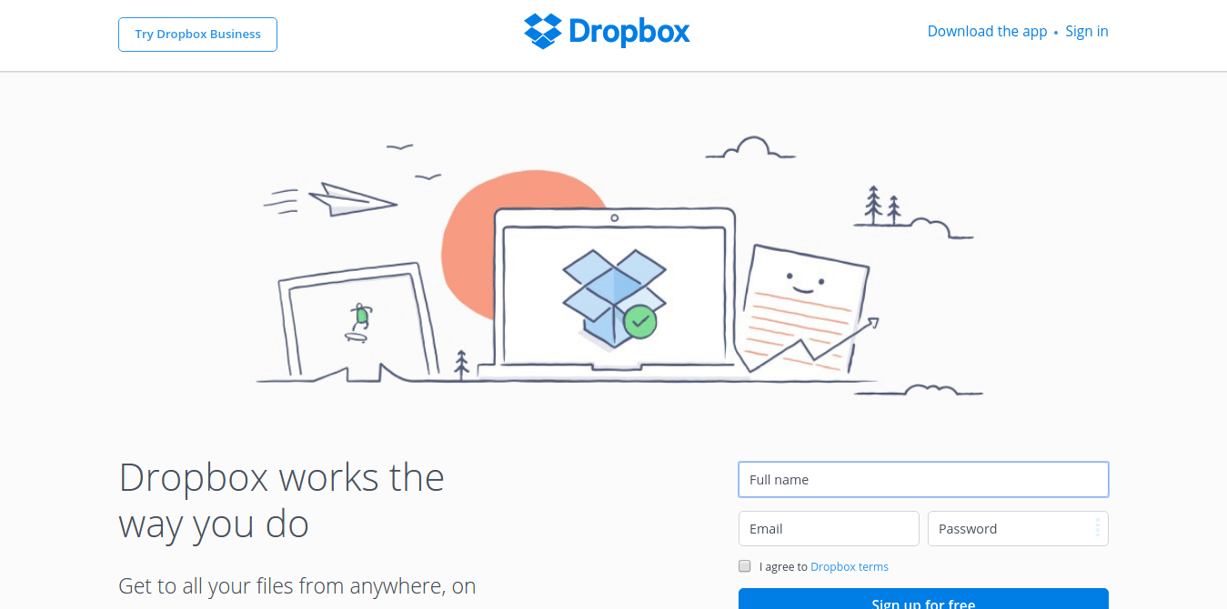
Stock photos are good. However, to give a website more personality, illustrations are regarded as the ideal alternative. Illustrations are more personal than royalty-free, use-any-way-you-want stock photos, and they appeal to the user’s imagination. For the site owner, other than having more control over the choices of images, the messaging is clearly understood by the users through visuals.
Image screenshot from: First Site Guide
Image screenshot from: Dropbox
12) Non-traditional navigation
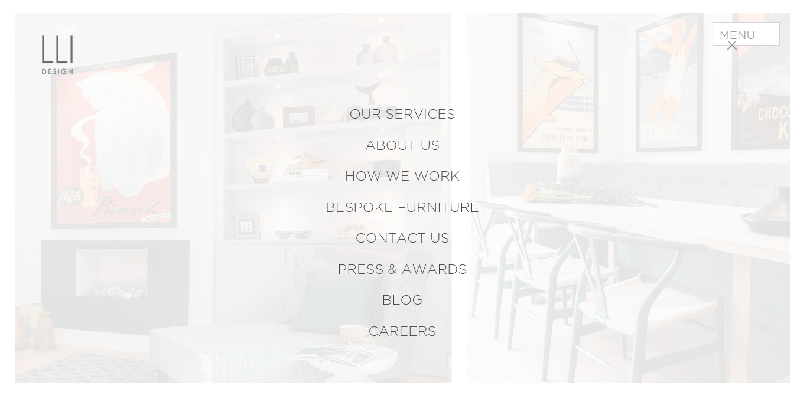
Web designers in the Philippines like us or anywhere in the world for that matter kept on experimenting with menus and navigations. The struggle seems too real, figuring out how to best showcase the most important pieces of content in the website more so because users are using different screens right now. This is a case to case basis, though, which involves finding out what works best for a specific website.
Image screenshot from: By Association Only
Image screenshot from: LLI Design
These are the current trends in web design and development. Some of these trends may no longer be relevant in 2017. Thus, we always suggest applying these trends in context. Only follow a particular trend if you deemed it beneficial to your users. If you don’t have a need for it, then don’t use it. It’s that simple.
Web design trends in 2014
Web design is a very important aspect of website development. The visual appeal, functionality, and usability of a website will be a huge factor in how appealing it is to your target readers. Also, a great website design will not remain great if it is not updated or redesigned to keep up with design trends. No matter how your website has been, a great website design is one that keeps on changing and being updated according to current industry trends and practices.
If you are planning to update your website design this 2014, below are some of the design trends that would be good to know so you can be specific with your web design company with what you want on your website.
Responsive web design
This is one trend that will hugely impact your current website. A responsive web design is one that adapts or adjusts according to the user’s screen size. With the growing number of Internet users who use a variety of devices for online browsing, having a website that will look good on any device is a must.
Parallax
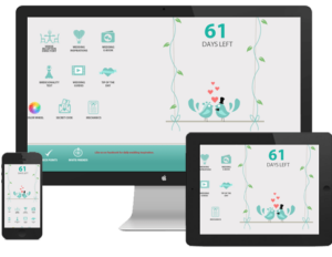
For those who want a 3D effect on their websites, putting a parallax effect is good. This kind of design is a “scrolling technique that helps in conjuring the illusion of the depth of field to the user”. This effect combines a great mix of effects on movement, depth, and 3D illusions.
Flat design
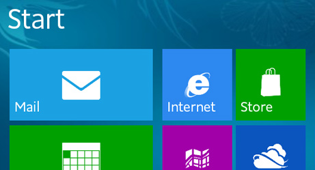
Think Windows 8 – this kind of flat user interface is enjoying renewed popularity. This can be attributed to the clean and minimalist look that a flat design can provide. Aside from this, a flat design is relatively easier and more straightforward to use.
Clean and minimalist
With the fast-paced lives of most people these days, there is no room for browsing a website that looks cluttered and whose navigation takes a little figuring out. What users are after are websites that are clean and minimalist, and can be used instinctively. Simplicity is the key so make sure to maintain a simple feel around your website.
Interactive
The use of infographics has increased in popularity tremendously the past few years. A great way to utilize your infographics and make them more functional is to make them interactive. With how common touch screens are, this should not be too difficult. Extend the use of interactive infographics by transforming your whole website into a huge interactive infographic.
One-page design
A house with several different rooms is, of course, more complex and difficult to navigate than one with just a single room. In the same line of reasoning, more websites are choosing to limit the number of pages to just one. These websites make use of lightboxes, overlays, and tiles that can be easily repositioned and expanded for various content on their websites.
Mix and match typography
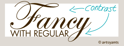
There are thousands (or even millions!) of fonts that you can choose from nowadays; why limit your design to just one? Using even just two different fonts can drastically change the readability of a particular content, even more so if you use more than two in a reasonable manner. Put variety in your typography in terms of size and styling. You may also want to utilize responsive typography that will make your site more interactive as well. However, make sure not to overdo the mixing and matching of typography. You would not want your website to look like it uses every font there is for you to use.
Mobile-ready
Having a responsive web design and one that is mobile-ready are two different things. You may have a website that looks good on any screen size but may not be well-optimized for mobile devices. A lot of web designers are designing websites in reverse nowadays. Instead of taking a desktop-friendly design and adjusting it to make it mobile-friendly, they are now designing a website first to be mobile-friendly and then adjusting it to be desktop-friendly as well. You can also make use of a minimalist navigation design such as a dropped sidebar.
Illustrations
The Internet is undoubtedly a very visual medium. Hence, elements that appeal to the sense of sight are almost always welcome. Illustrations and images in a website are musts if you want it to be visually appealing. To make your images more interesting, add overlays and blurriness effects.
Video background
A growing number of websites are now using videos in place of text to get a particular message across to its visitors. Why use static text when you can use exciting and dynamic videos? Many websites have even extended the use of videos in their websites by using the video as their website background.
Top 10 Web Design Trends for 2014 Infographic
Technology advances, bringing web design and development requirements to more technical levels. Nonetheless, usability, functionality, and experience are still the highest priorities.
The 2025 web design trends mentioned above may be technical to implement, yet they can make any website more user-friendly.
Some of the abovementioned trends have already gained traction in the previous years. However, their usefulness is paramount, and more and more designers and developers will surely adopt the trends this year, 2025, and beyond.
With our experience and expertise, our dev team can create the website you like. Contact us now!

